MCAD Student Portfolio
Jacob Zweibohmer
This page is dedicated to work created by Jacob Zweibohmer at the Minneapolis College of Art and Design in the Master of Arts in Graphic and Web Design program (2023-2025).
RIGHT: Drop Cap design from Spring 2024’s Typography course.
I utilized Adobe Ilustrator’s 3D capabilities, along with other illustrative techniques to create this piece.
Design in Context
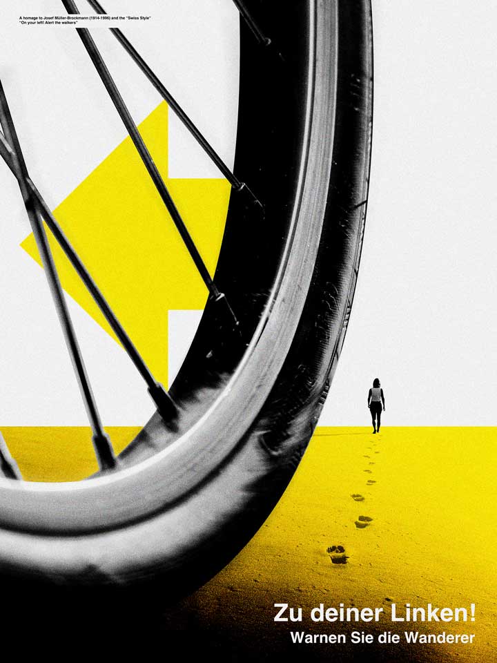
LEFT IMAGE: This poster is an homage to the work of Josef Müller-Brockmann. It is a call to action to alert walkers that you are passing on the left while biking. Work was completed in the Design in Context course in fall of 2023 after studying the work of Swiss Masters.
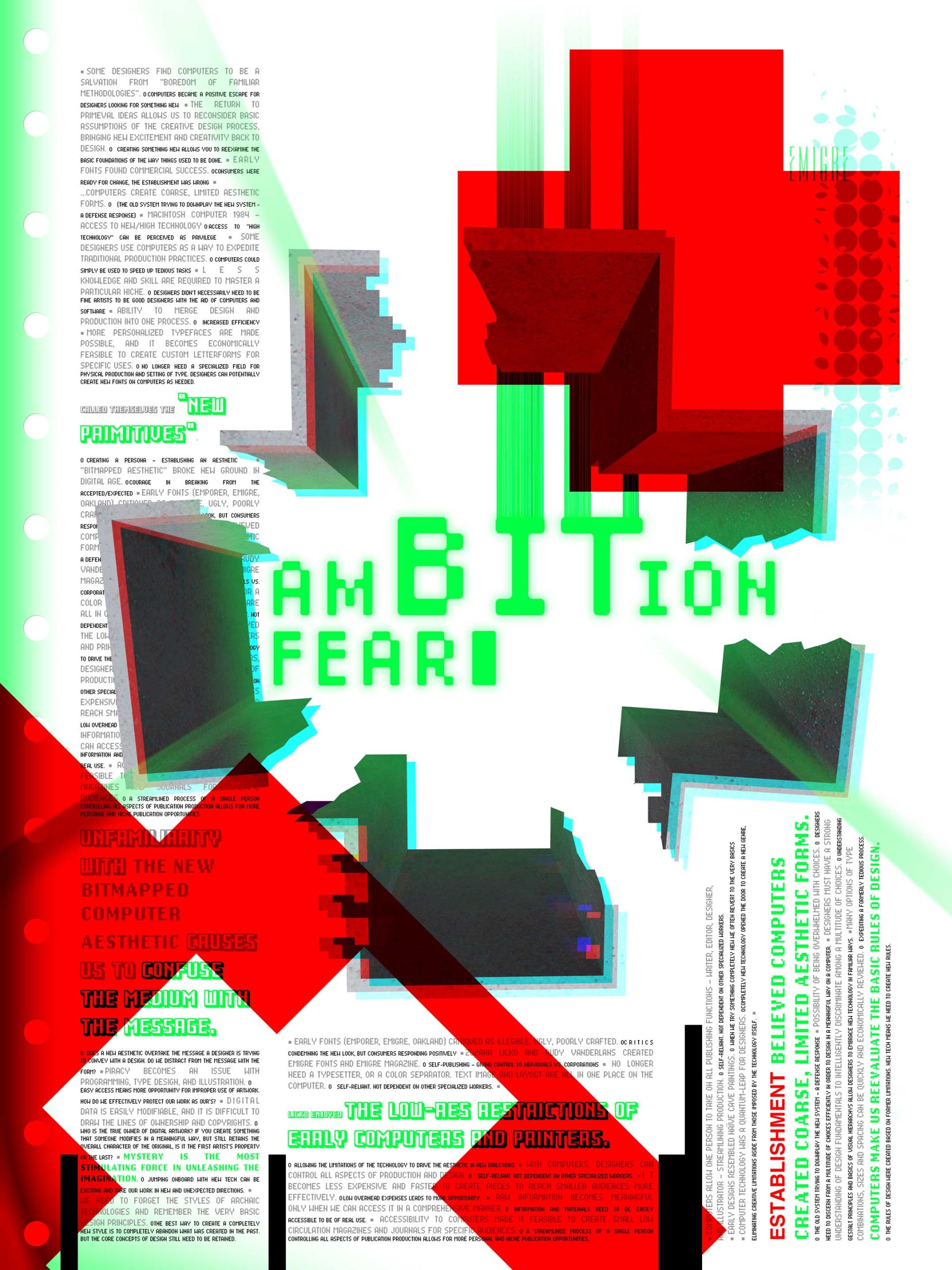
RIGHT IMAGE: Poster design interpreting the reading of “Ambition and Fear” about the early work of Emigré. In contrast to the left image, this work is more of a rebellion against the Swiss Style. Work was completed in the Design in Context course in fall of 2023
I feel that graphic design is what I was called to do. I can’t imagine a life where I am not designing, redesigning, or imagining better design in the world around me…
Programming for the Web
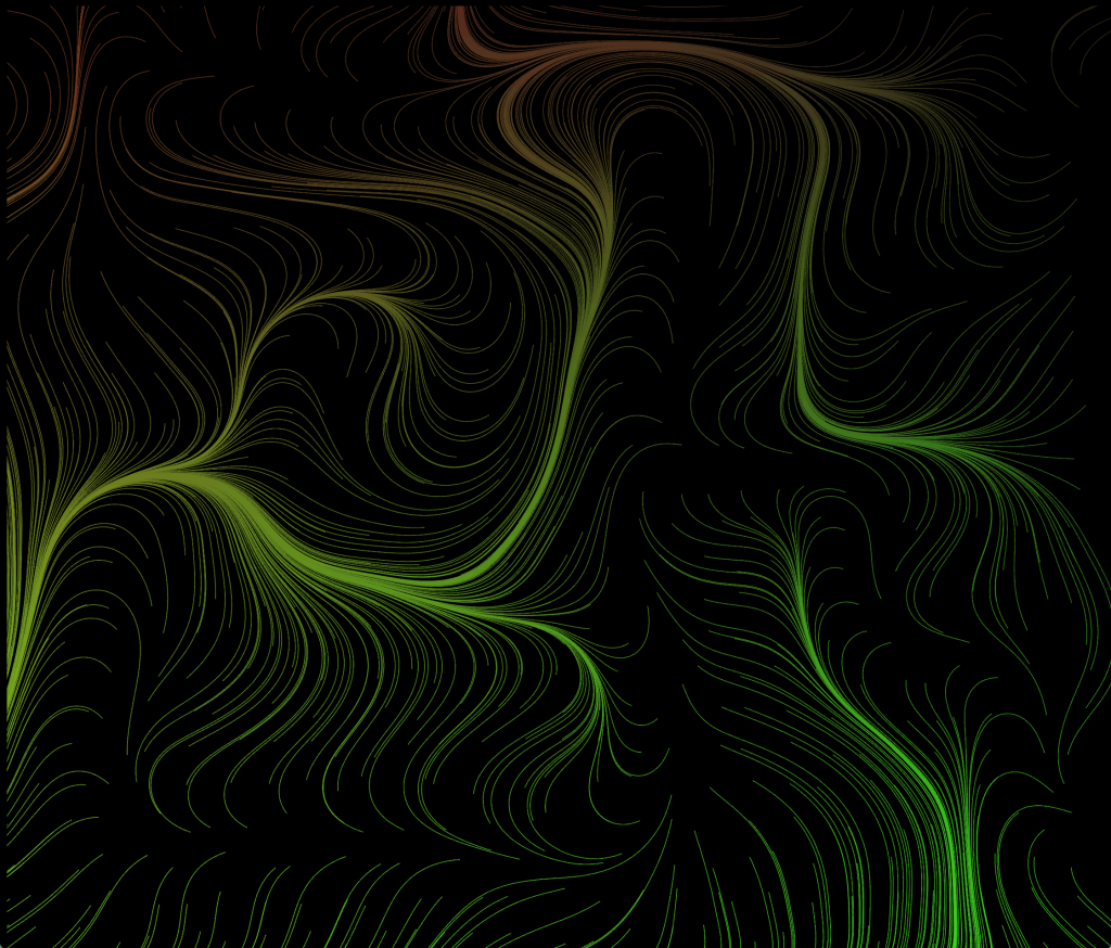
In our Programming for the Web class I was able to utilize techniques taught in class mixed with other tutorials to create some art focused generative programming, and interesting interactive typographic work.
Flow Field Generator. I am an avid cyclist. This flow field gave me a sense of wind direction. Wind seems to be my number one concern each time I go for a ride. I programmed the flow field to change in constructed composition as well as color combinations each time the web browser is reloaded. You can click with your mouse at any time to download a transparent png file of your generated design.
Click the image to open and interact with the program.
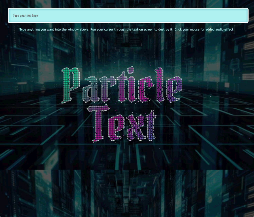
Particle Text program. I concepted this idea as a way to release a little tension. You can type in a phrase or simply a name. Then you can interact with the text through mouse gestures. As you click there will be some aggressive sound effects to help amplify the experience.
Click the image to open and interact with the program.
Typography
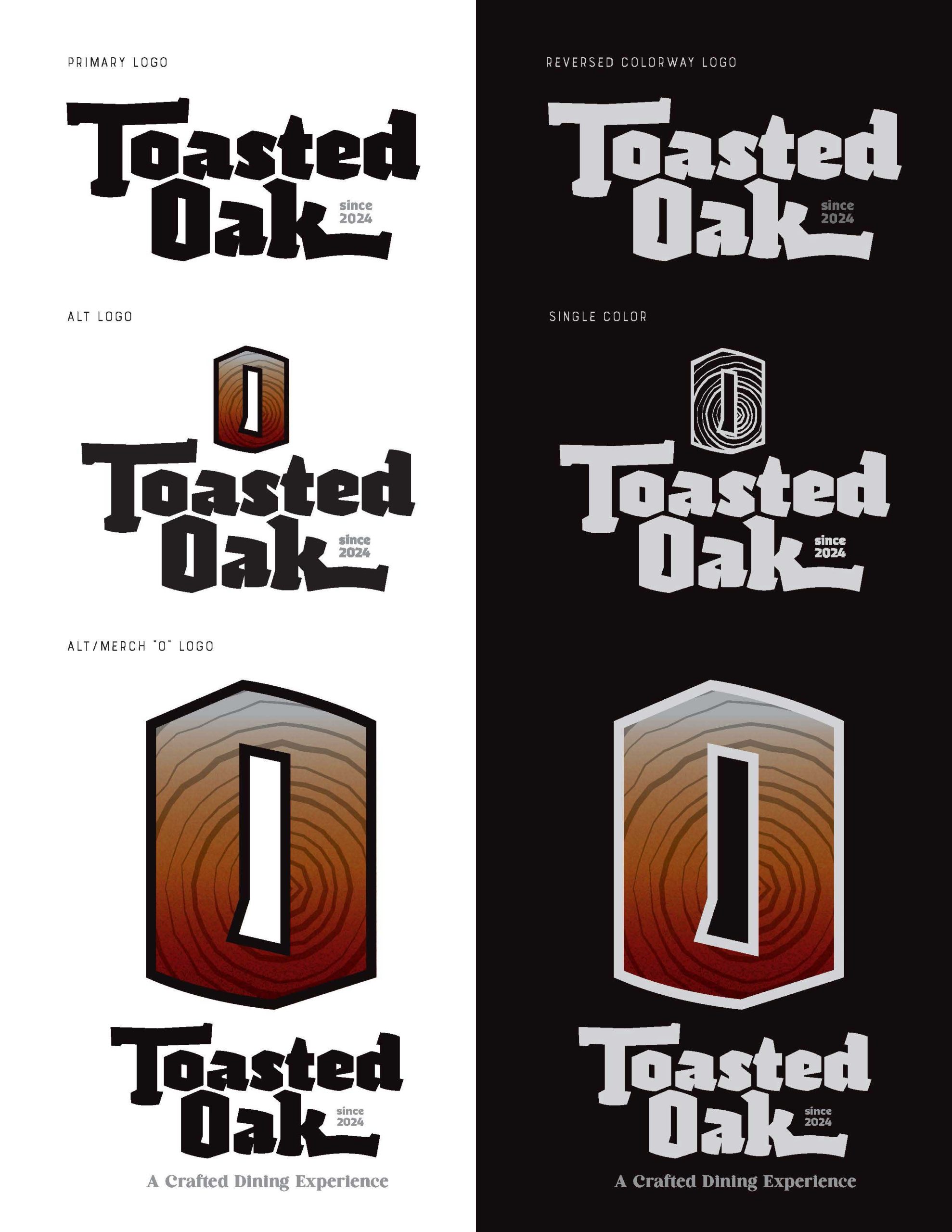
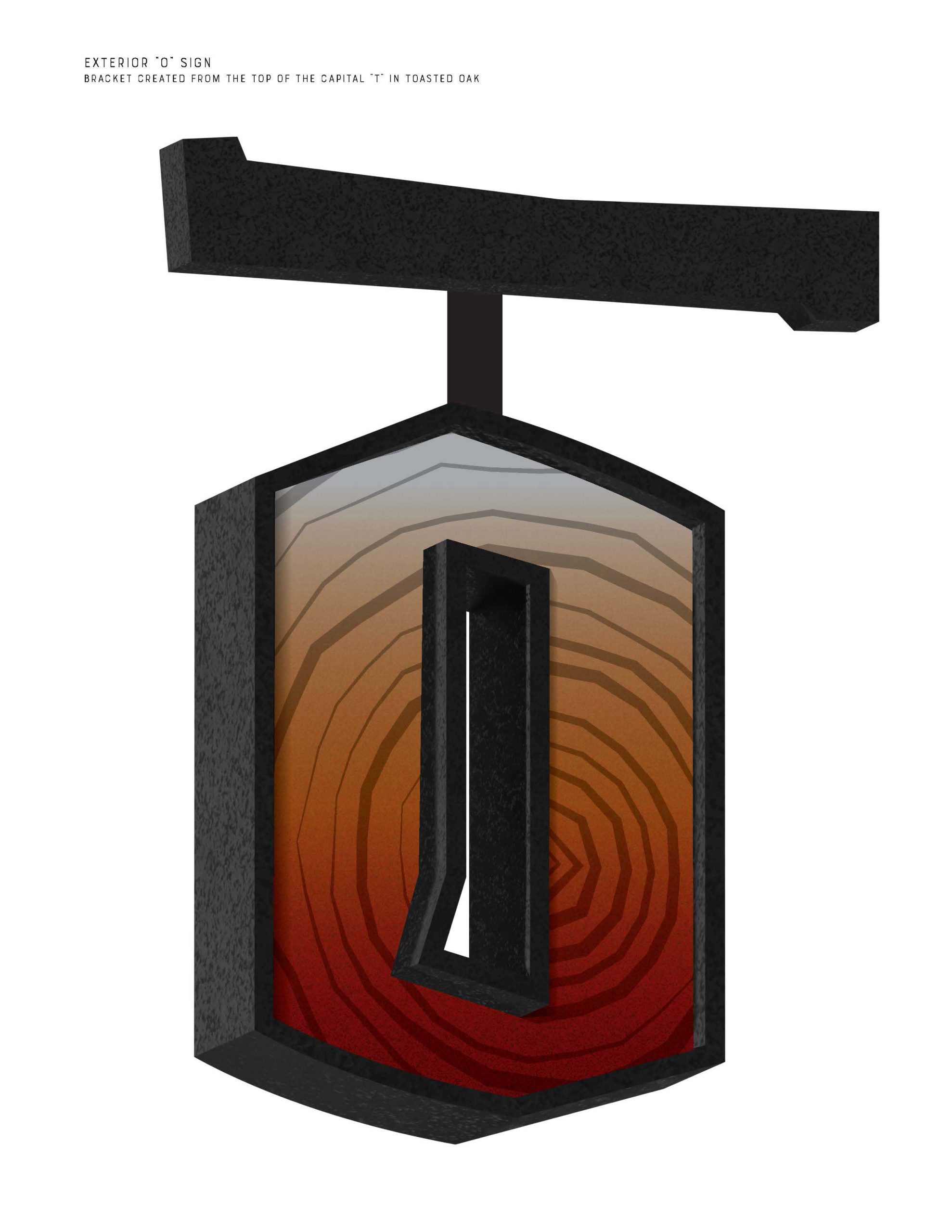
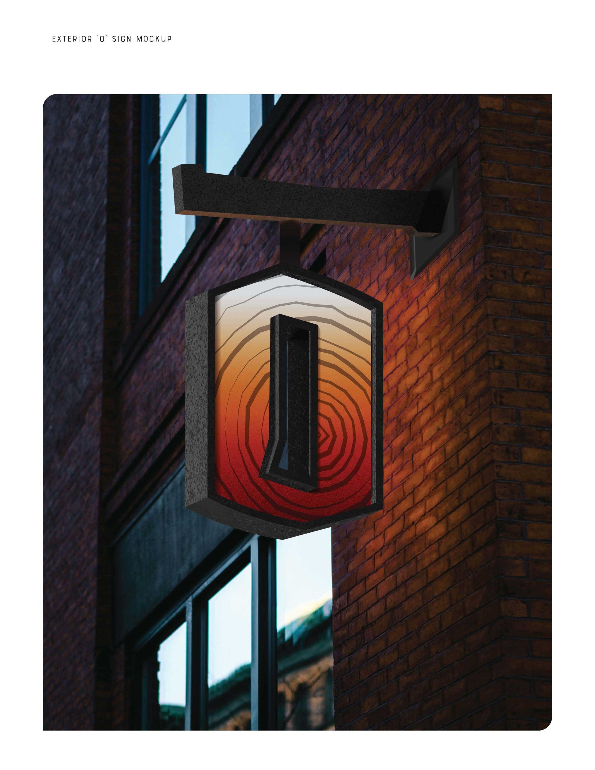
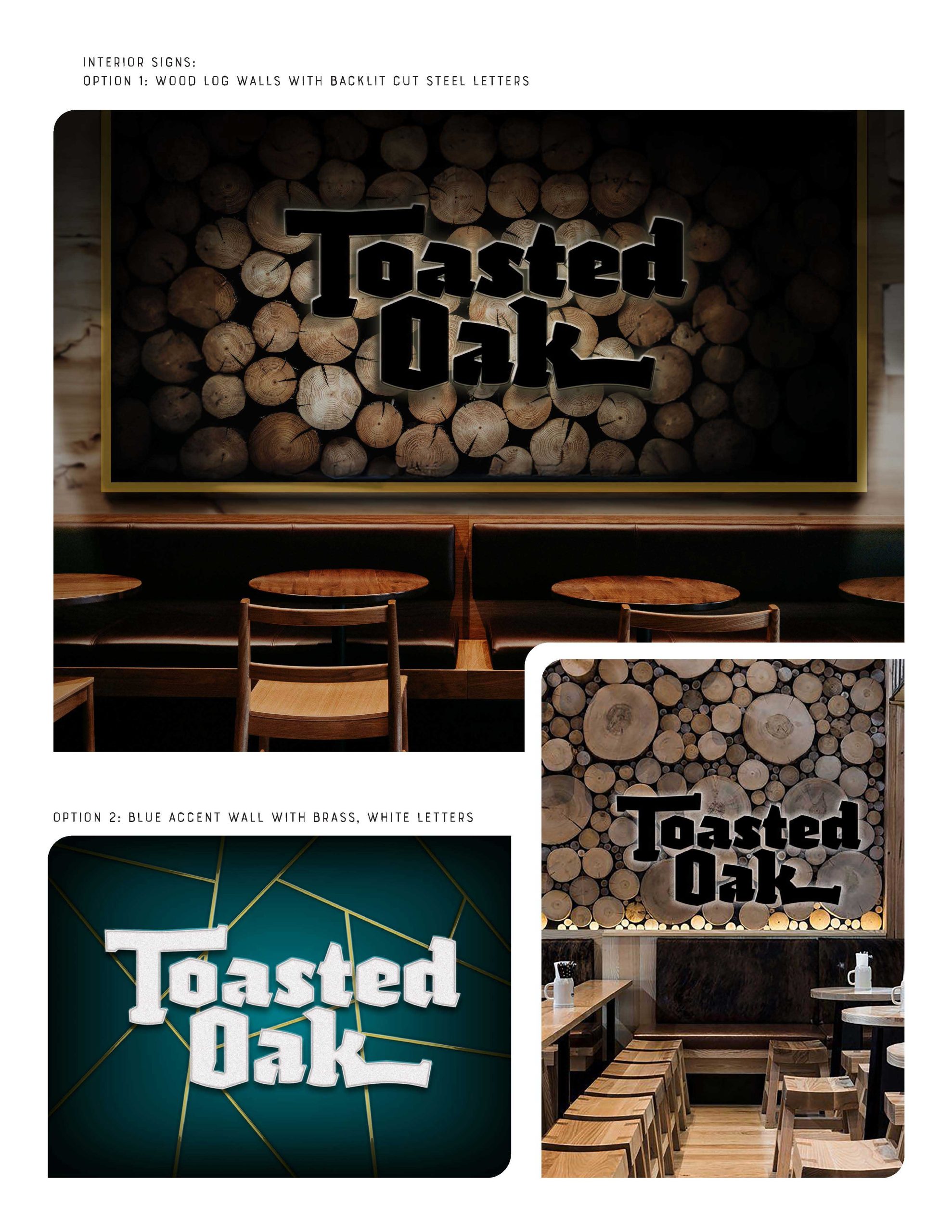
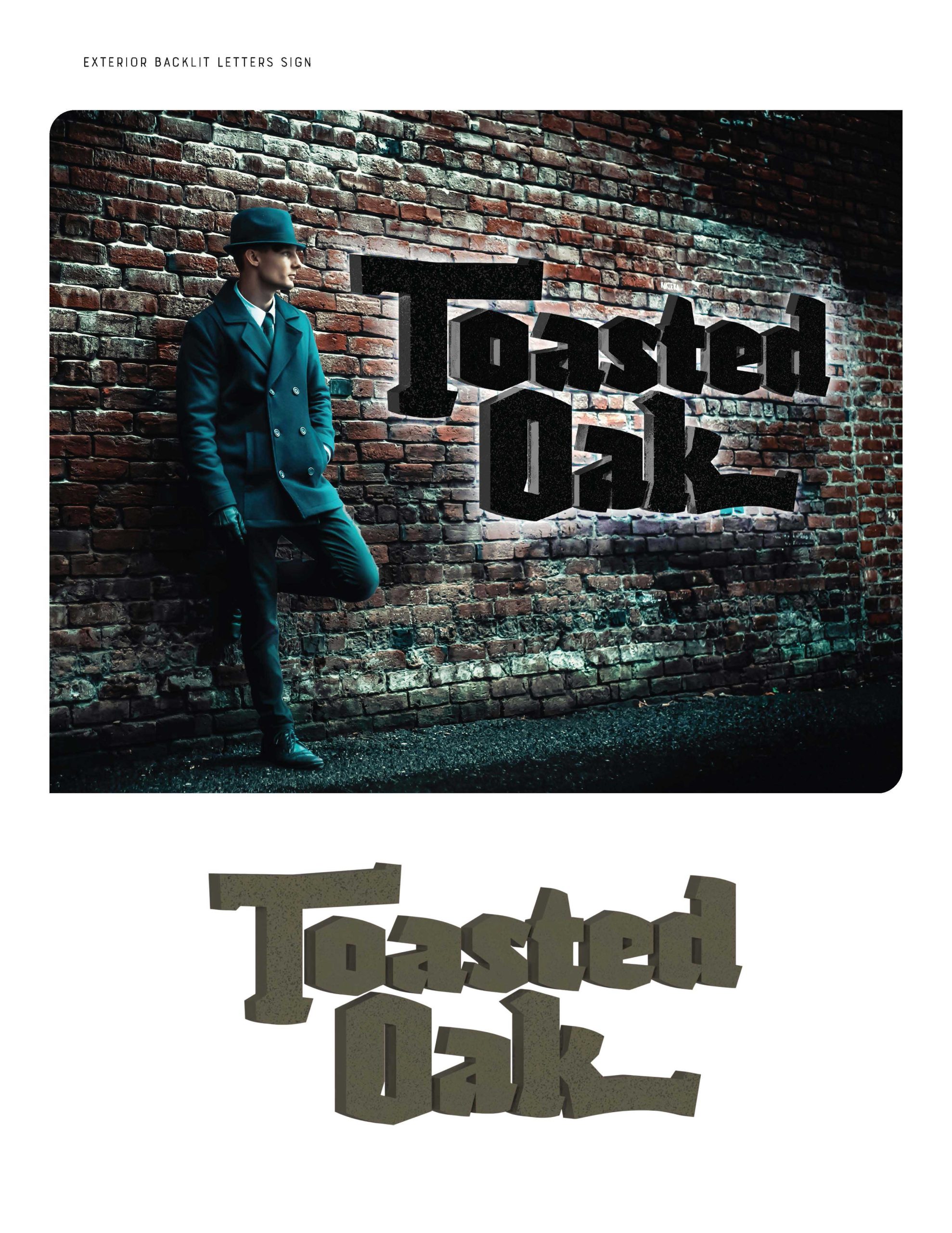
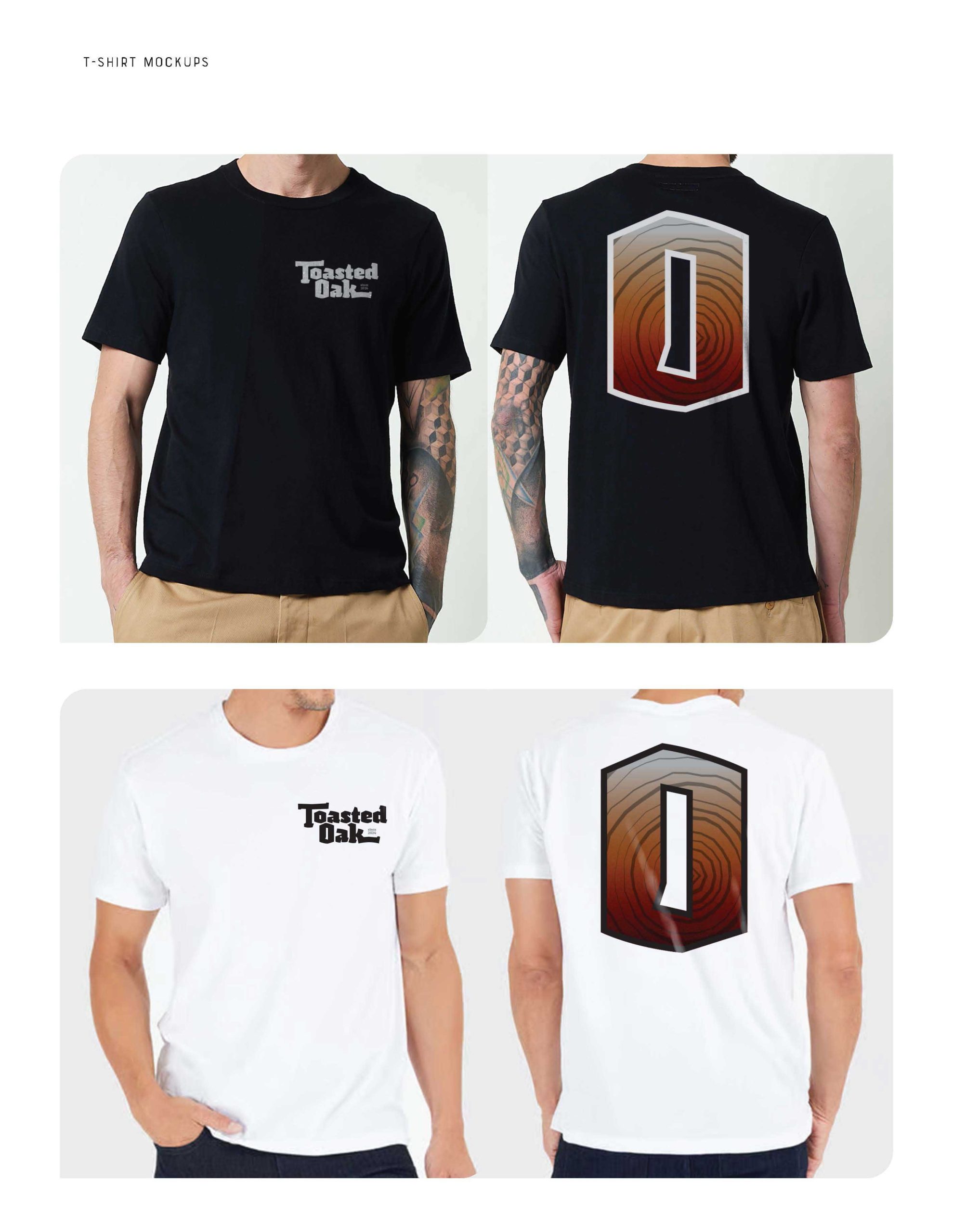
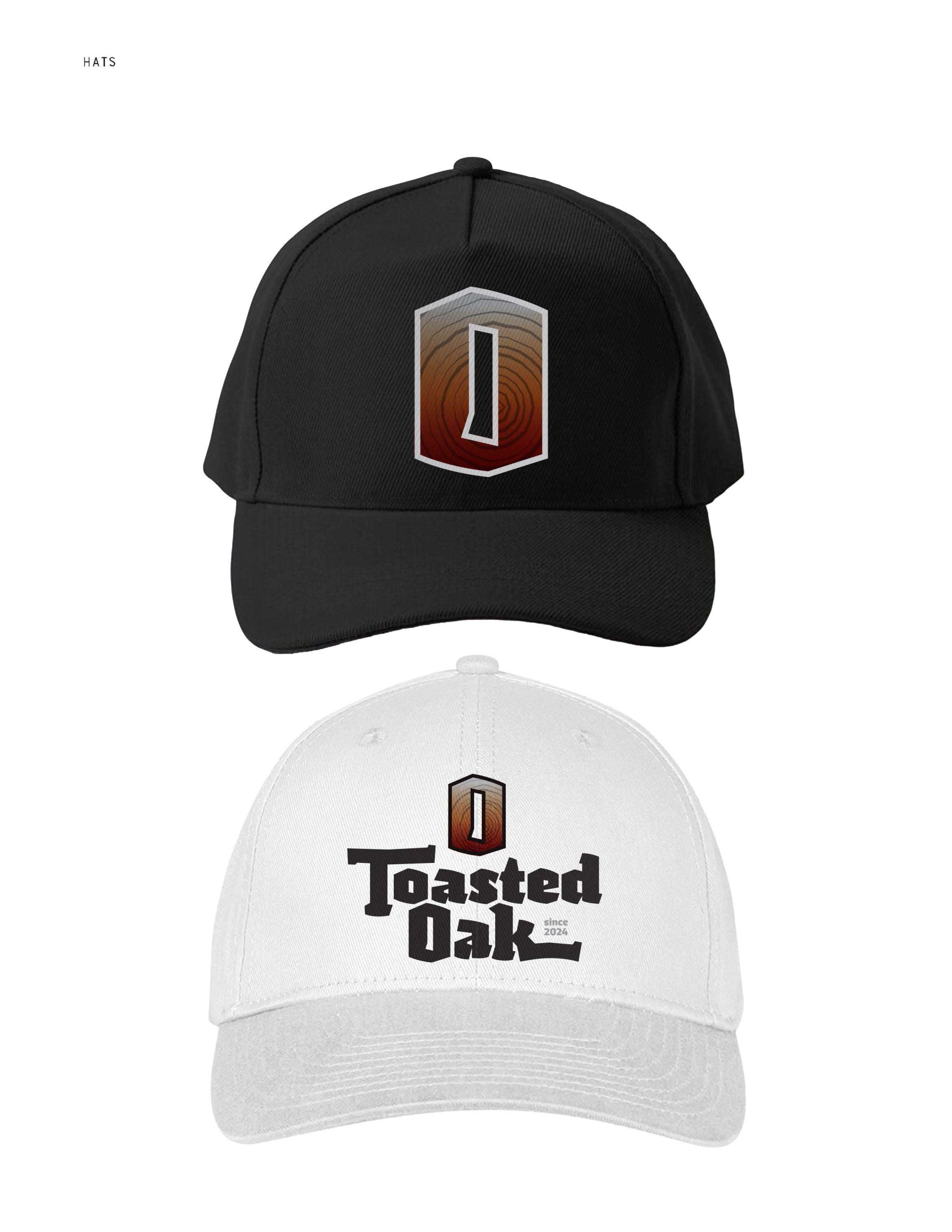
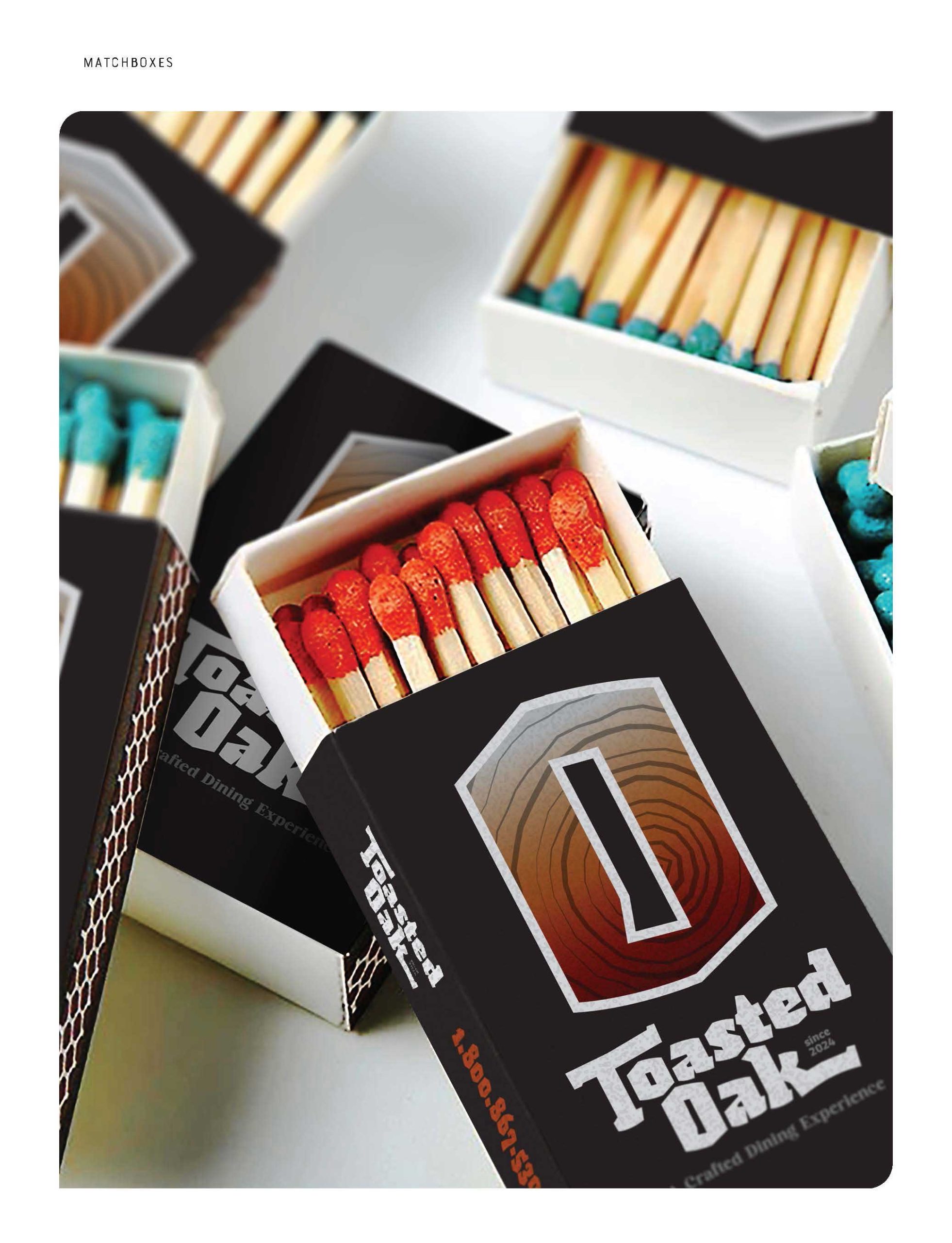
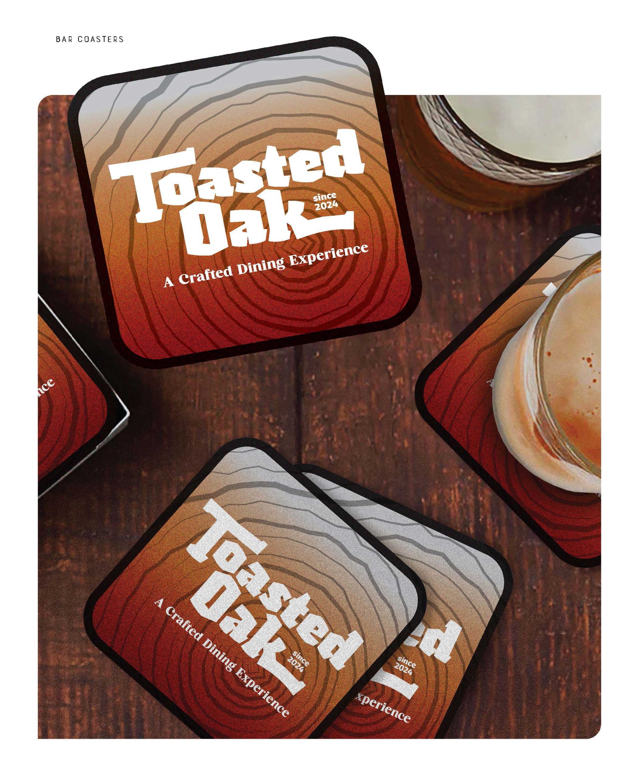
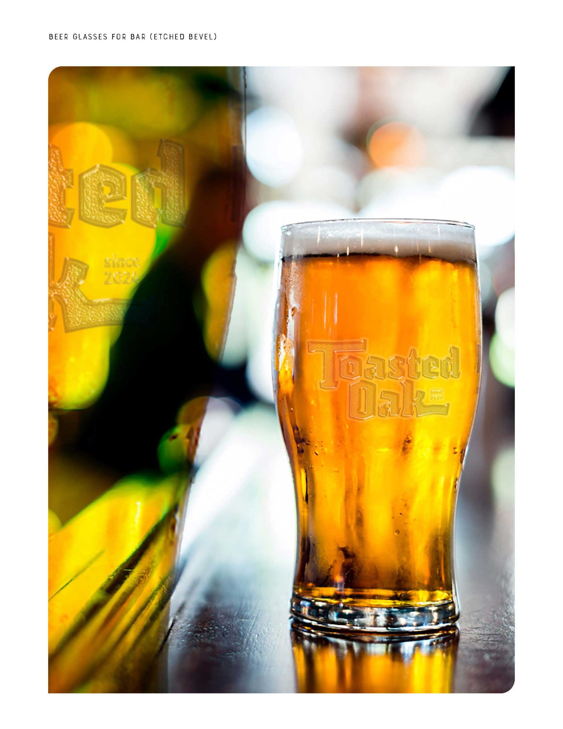
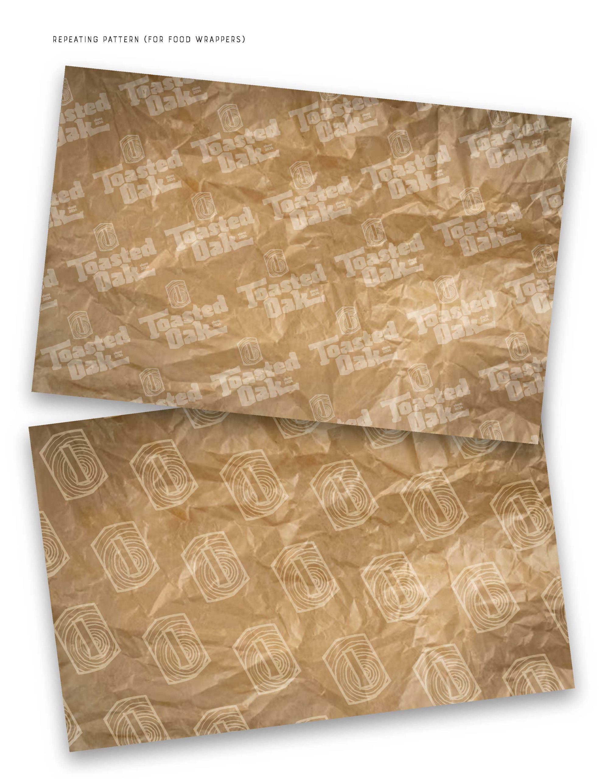
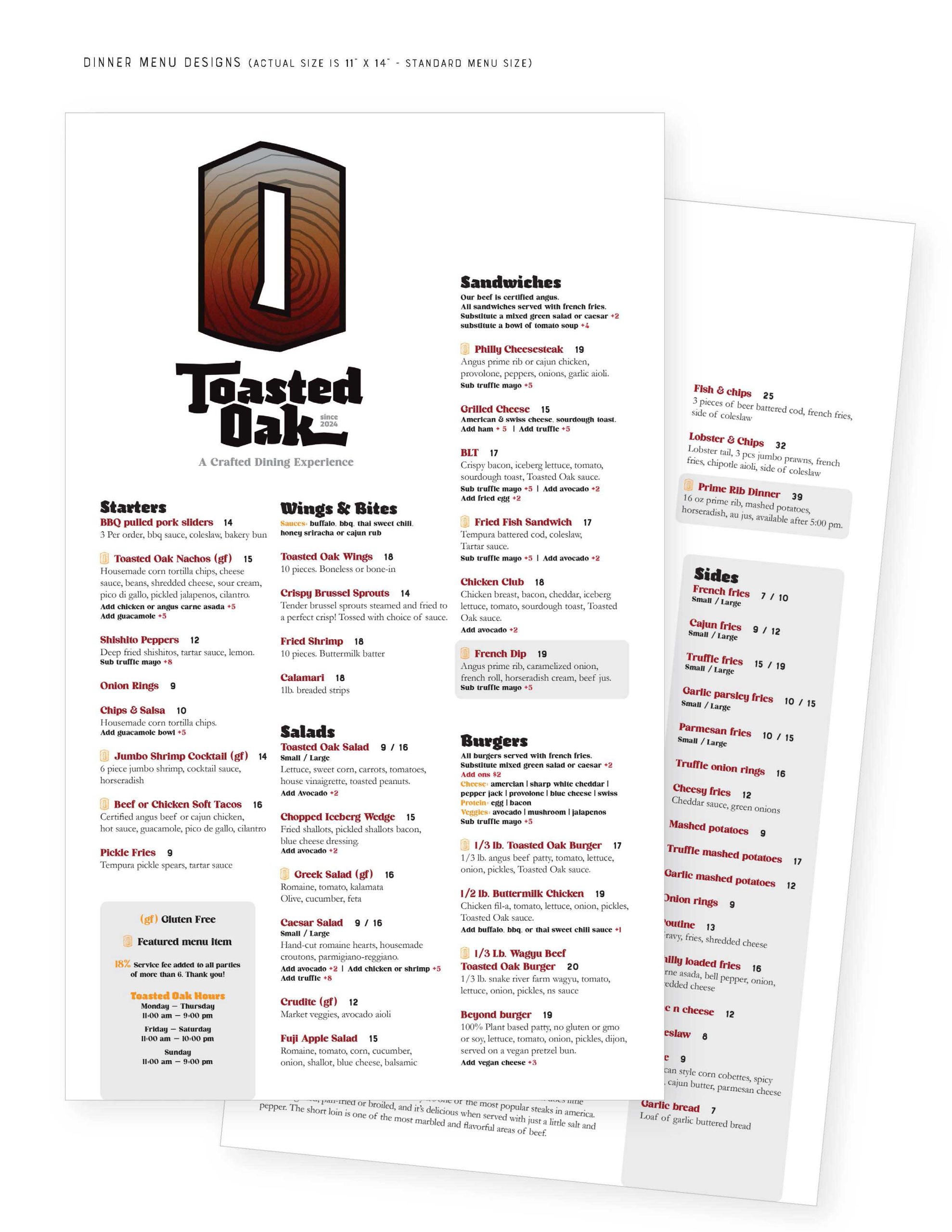
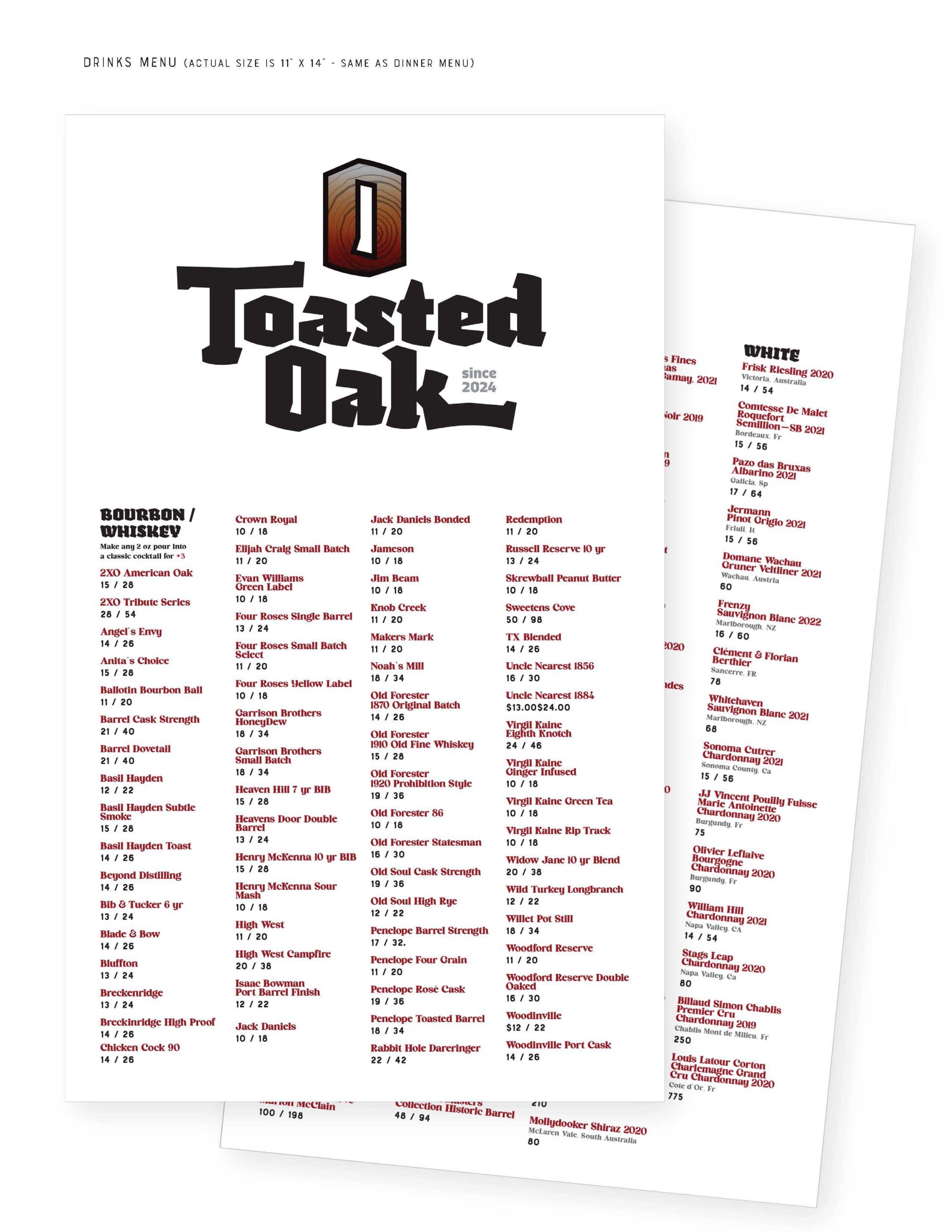
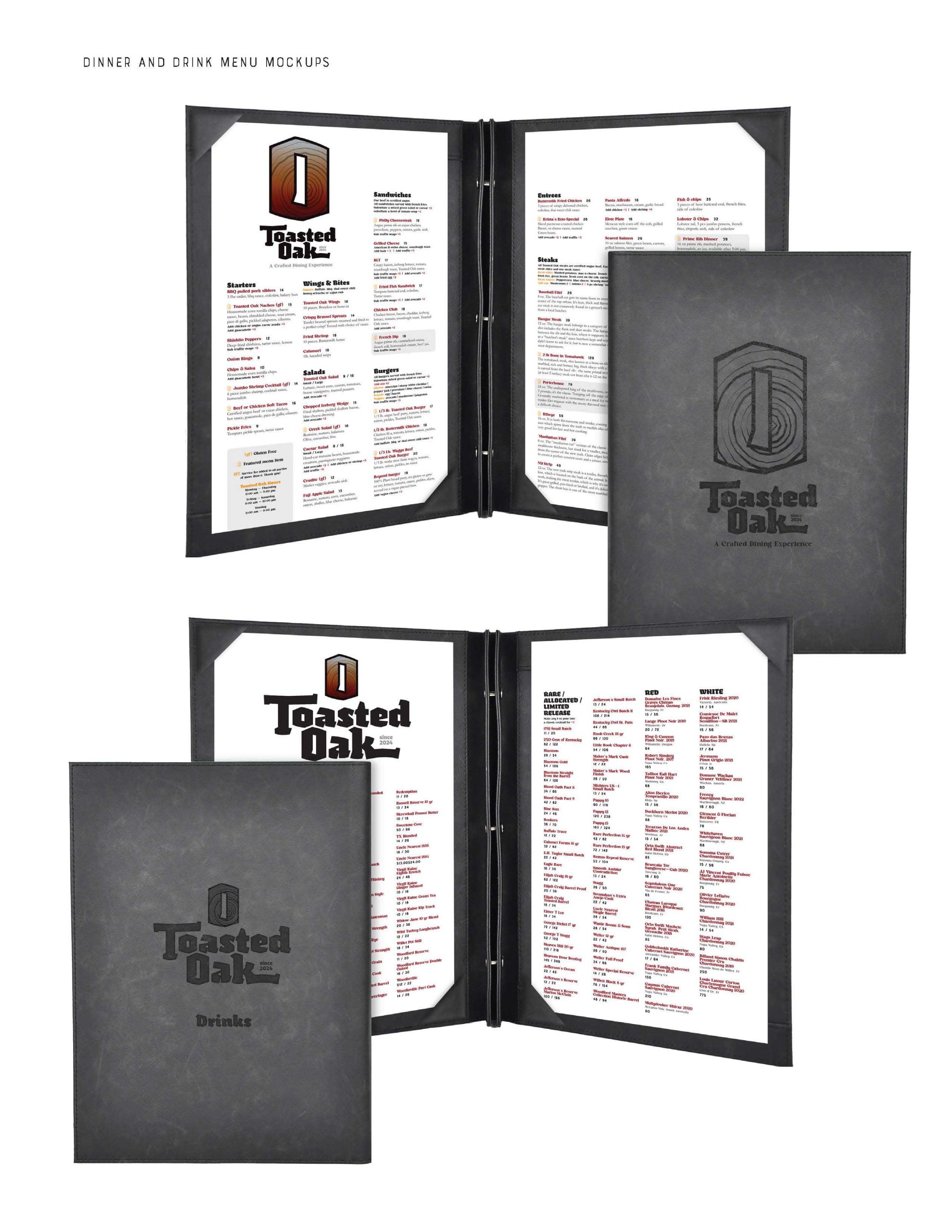
Toasted Oak Restaurant Logo Concept and Brand Applications: One of my favorite assignments in my Typography course was to create a logo concept for a restaurant. I invented “Toasted Oak” as a higher-end dining experience. This would be the sort of restaurant serving a variety of steak choices, paired with a variety of bourbons and wines. The interior would be very warm and cozy. I envision lots of warm wood tones, polished concrete, exposed brick, leather, dark tones with splashes of brighter oranges and blues. The smell of the wood fire oven hanging in the air like perfume. This is what helps to make Toasted Oak “A Crafted Dining Experience”.
I emphasize the O for Oak as a way to make an iconic illustrative element for the brand. I added growth rings and colors and texture representing heat, toasting, etc. I chose a typeface for the signature portion of the logo that also reflected a sense of charred wood. I used images of burnt wood to help me select the perfect typeface for the project.
Below are images from my presentation on the use and implementation of the logo within the Toasted Oak world. I include Exterior sign options, interior signs, apparel, matchboxes, coasters, etched glasses, food wrappers, and Food and Drink Menus. Click on the gallery, below, for larger images.
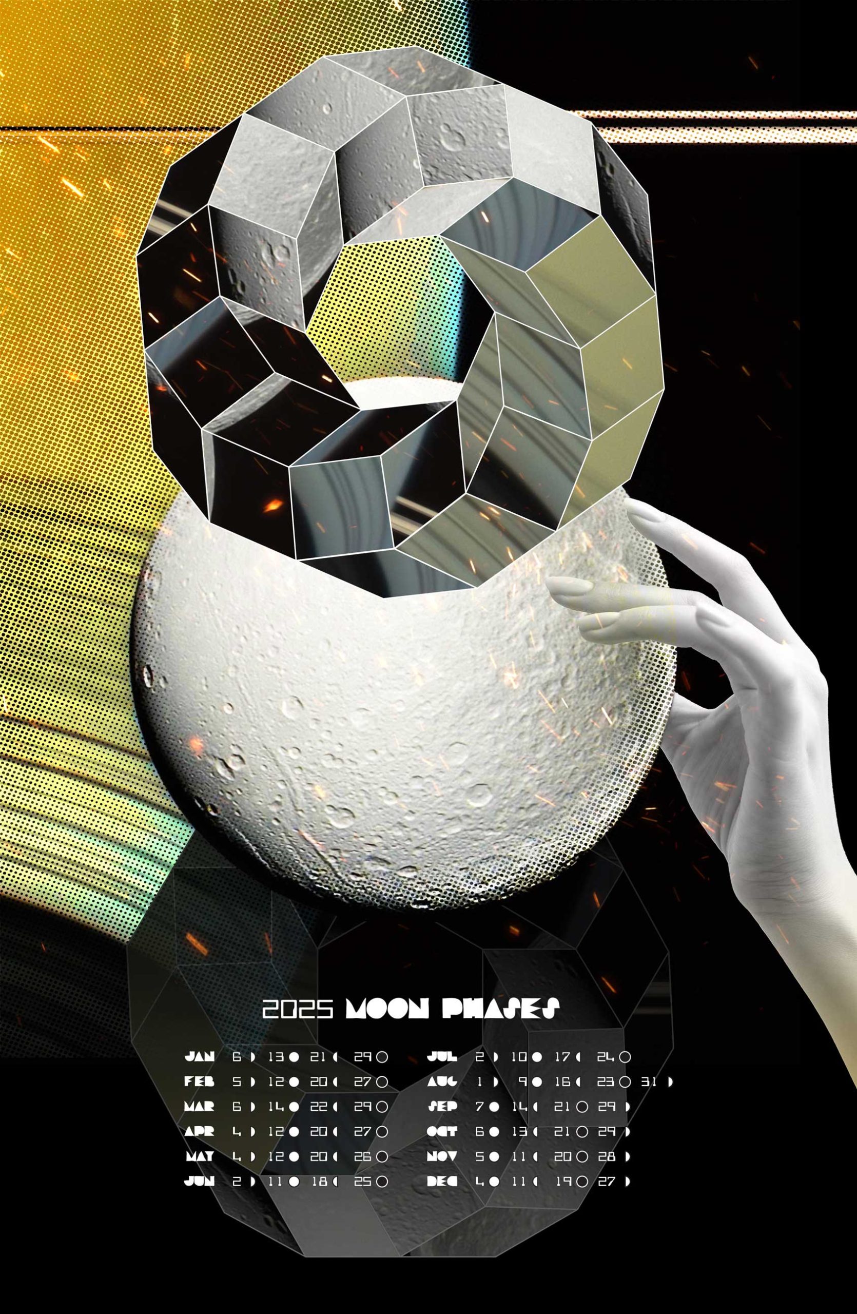
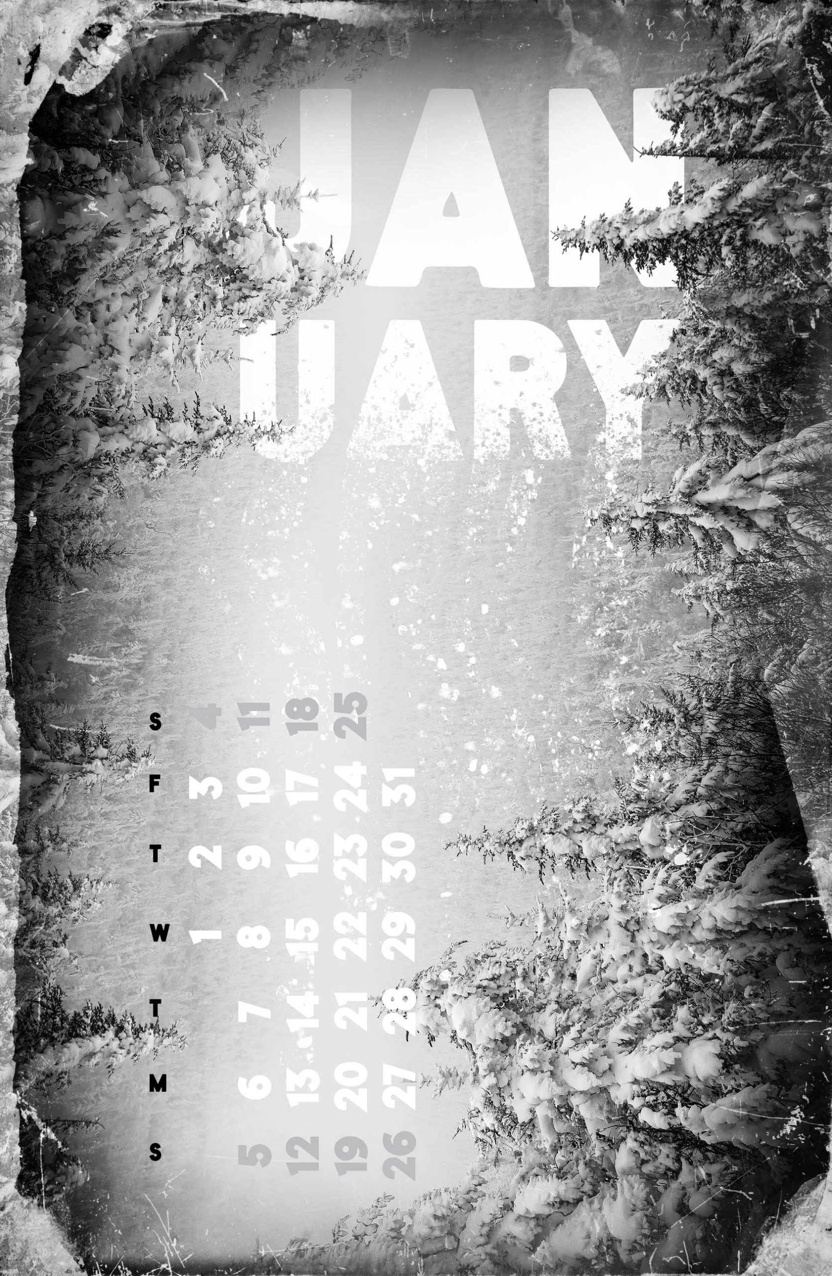
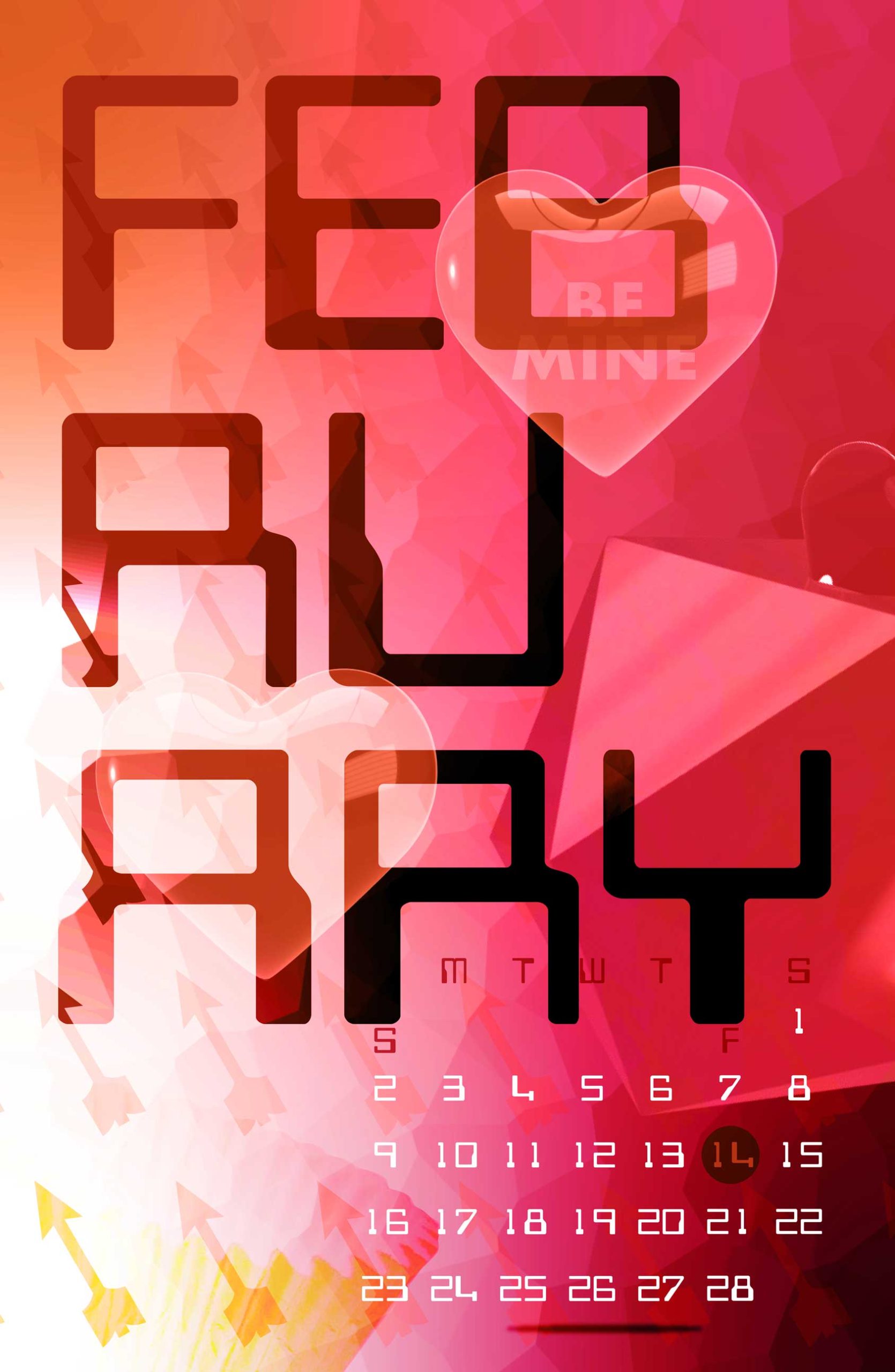
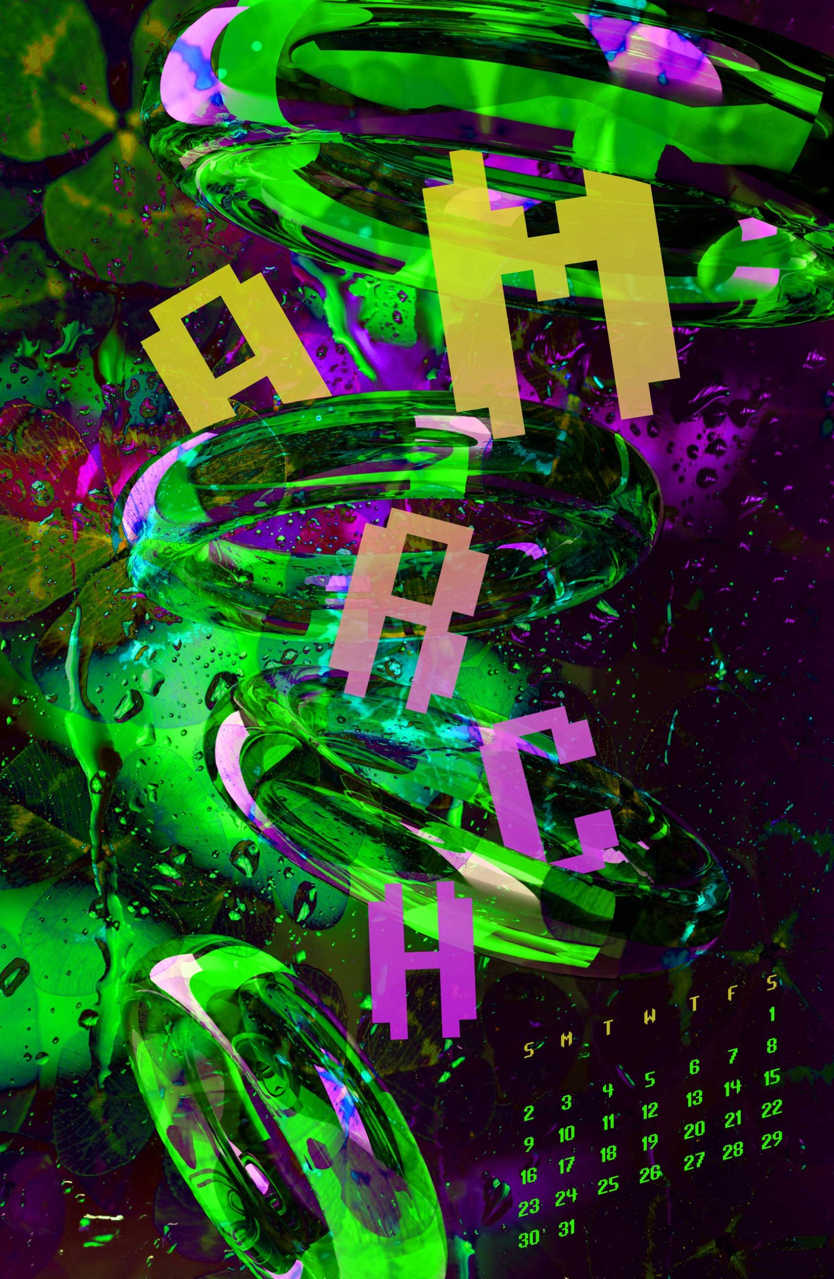
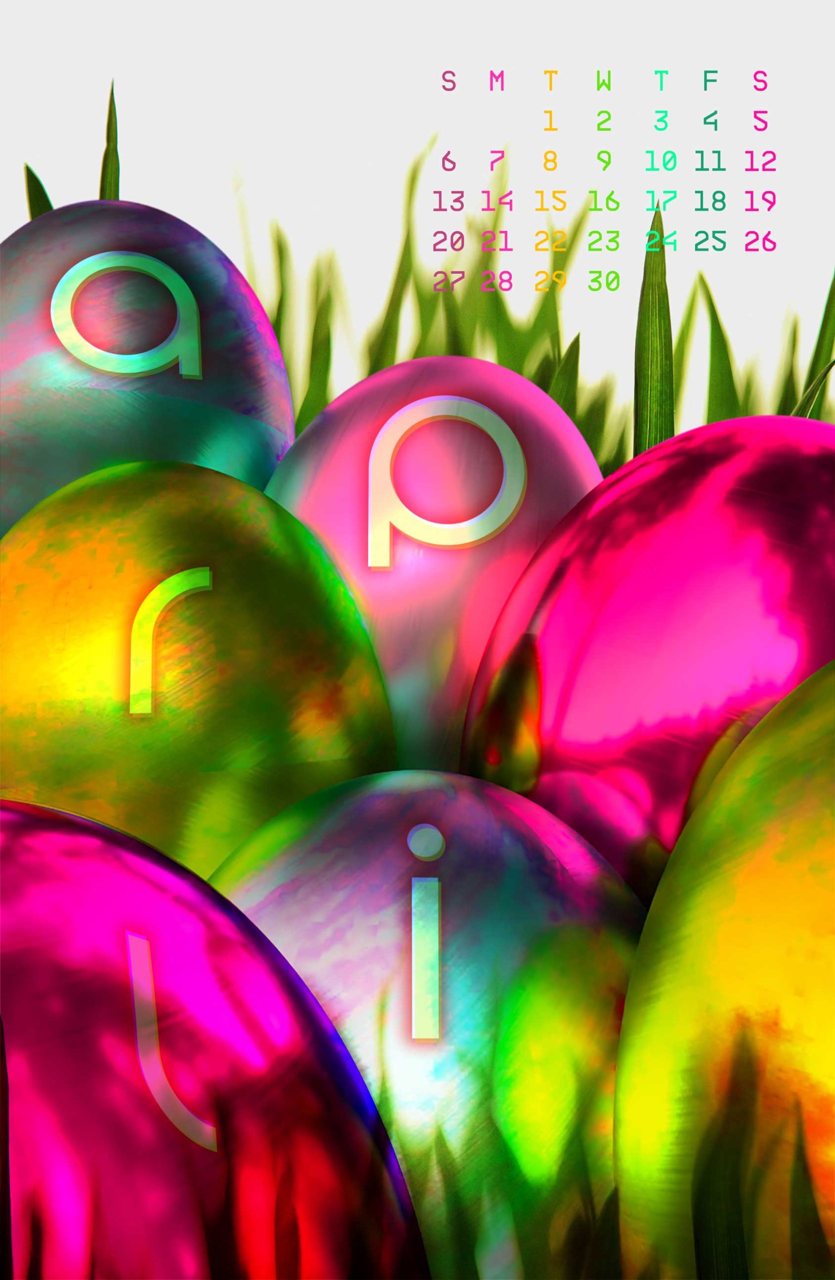
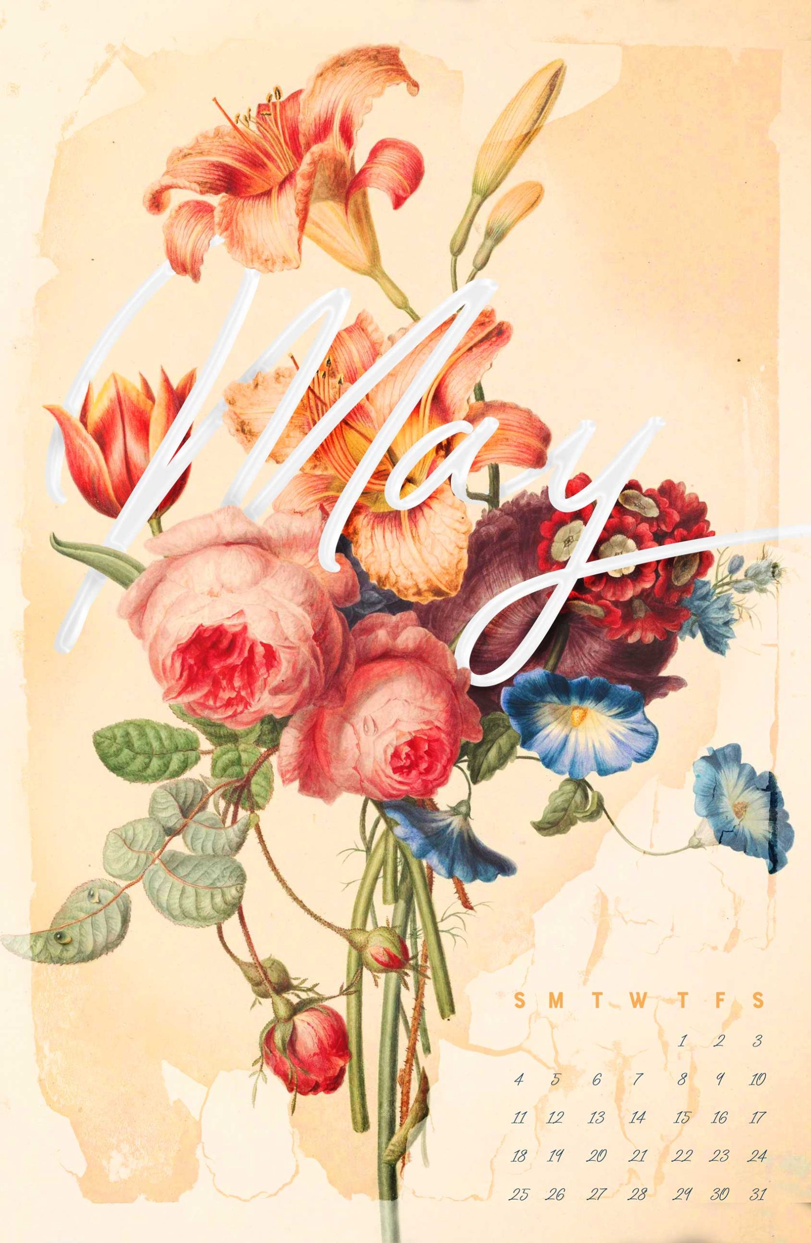
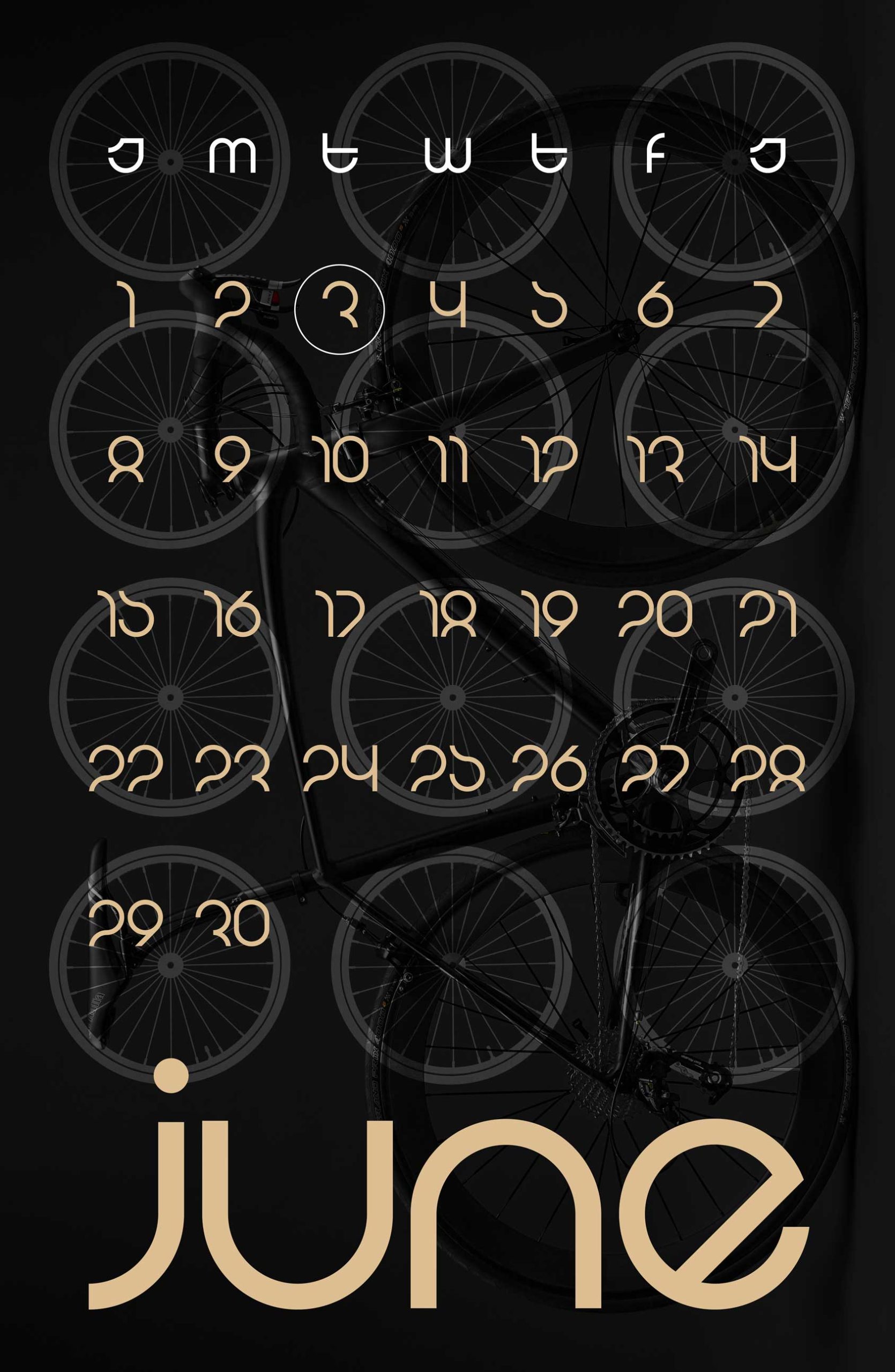
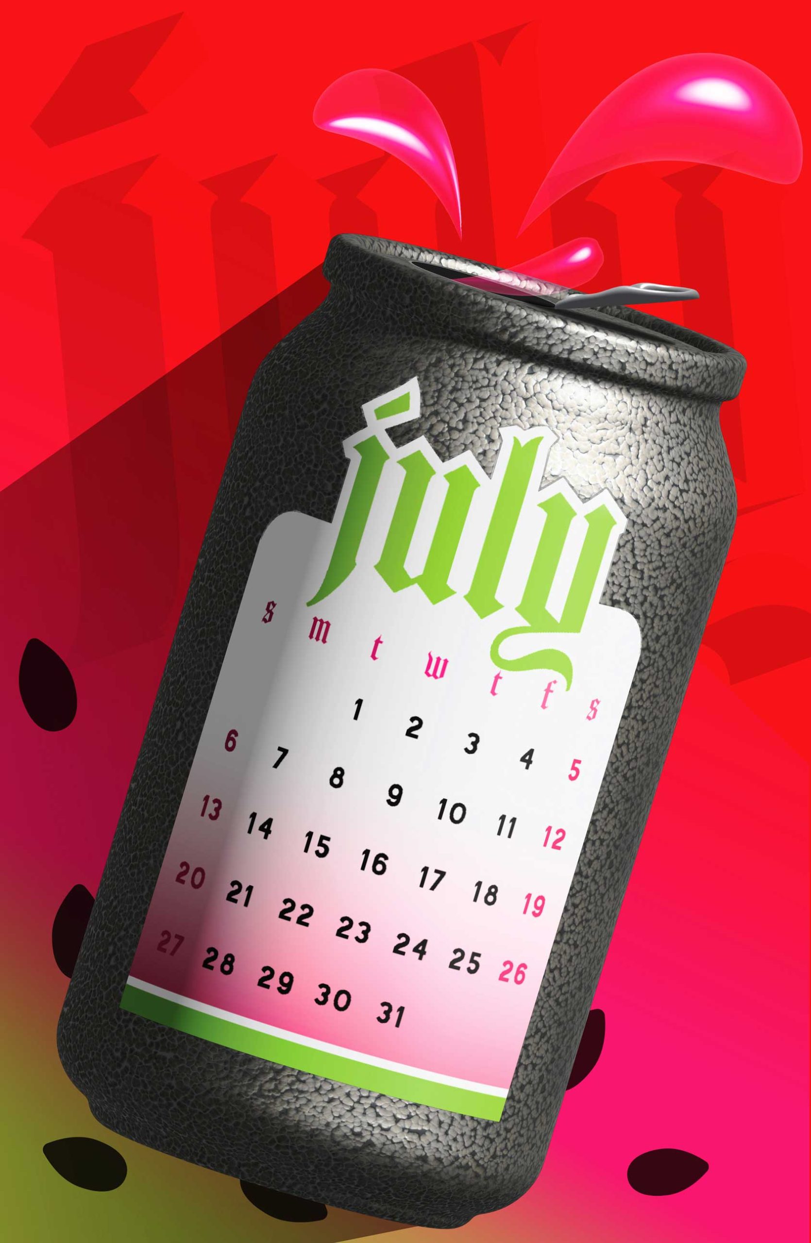
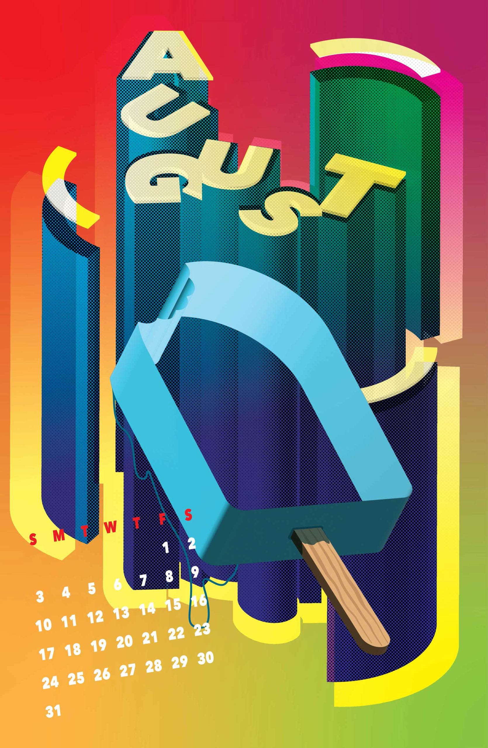
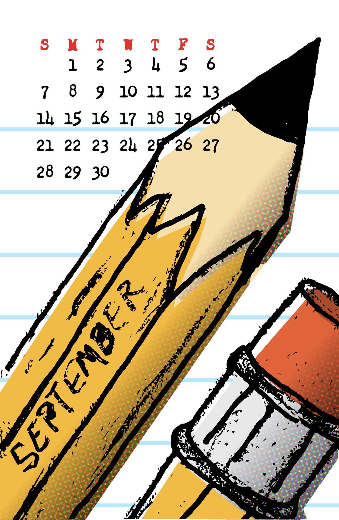
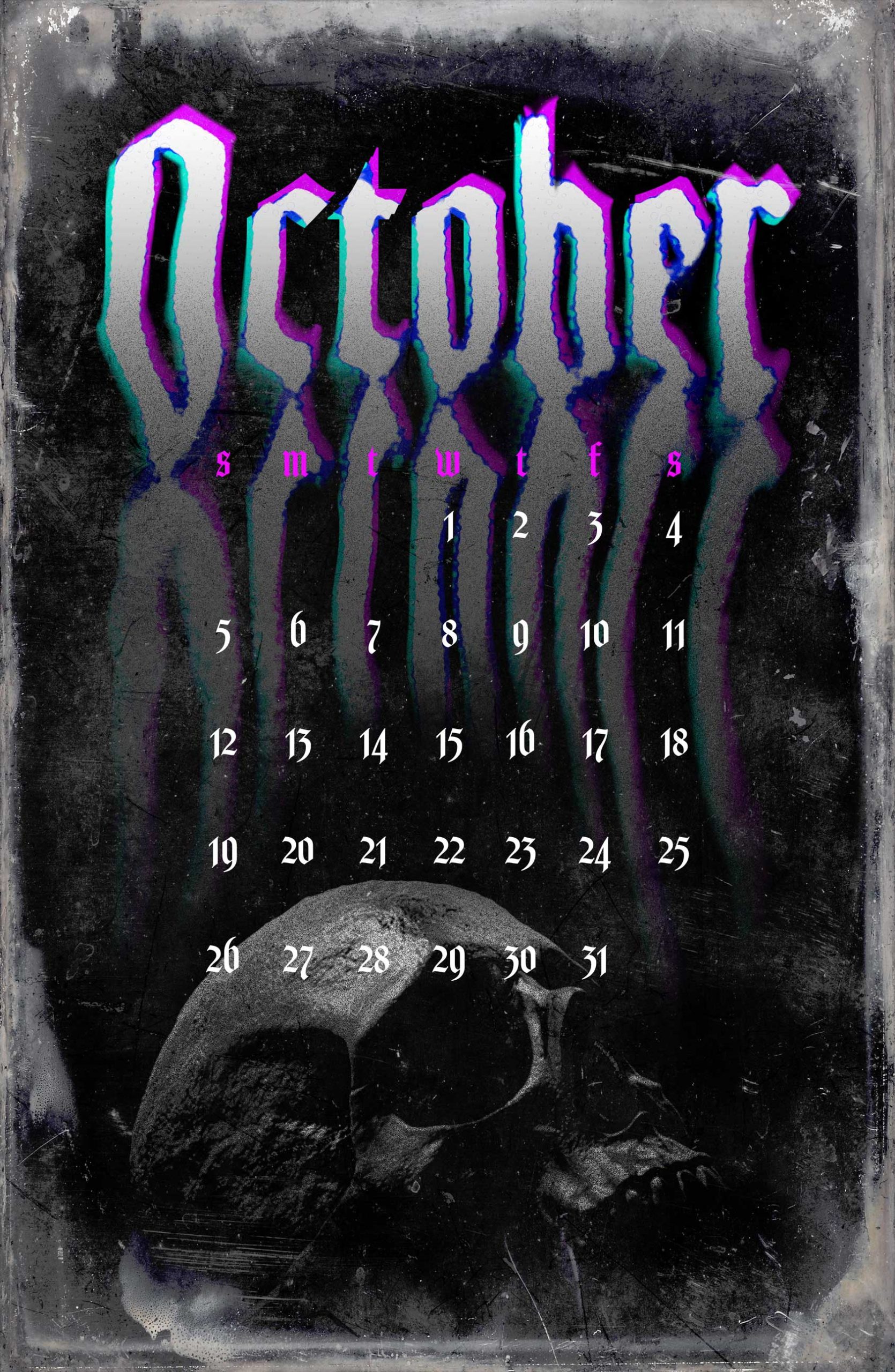
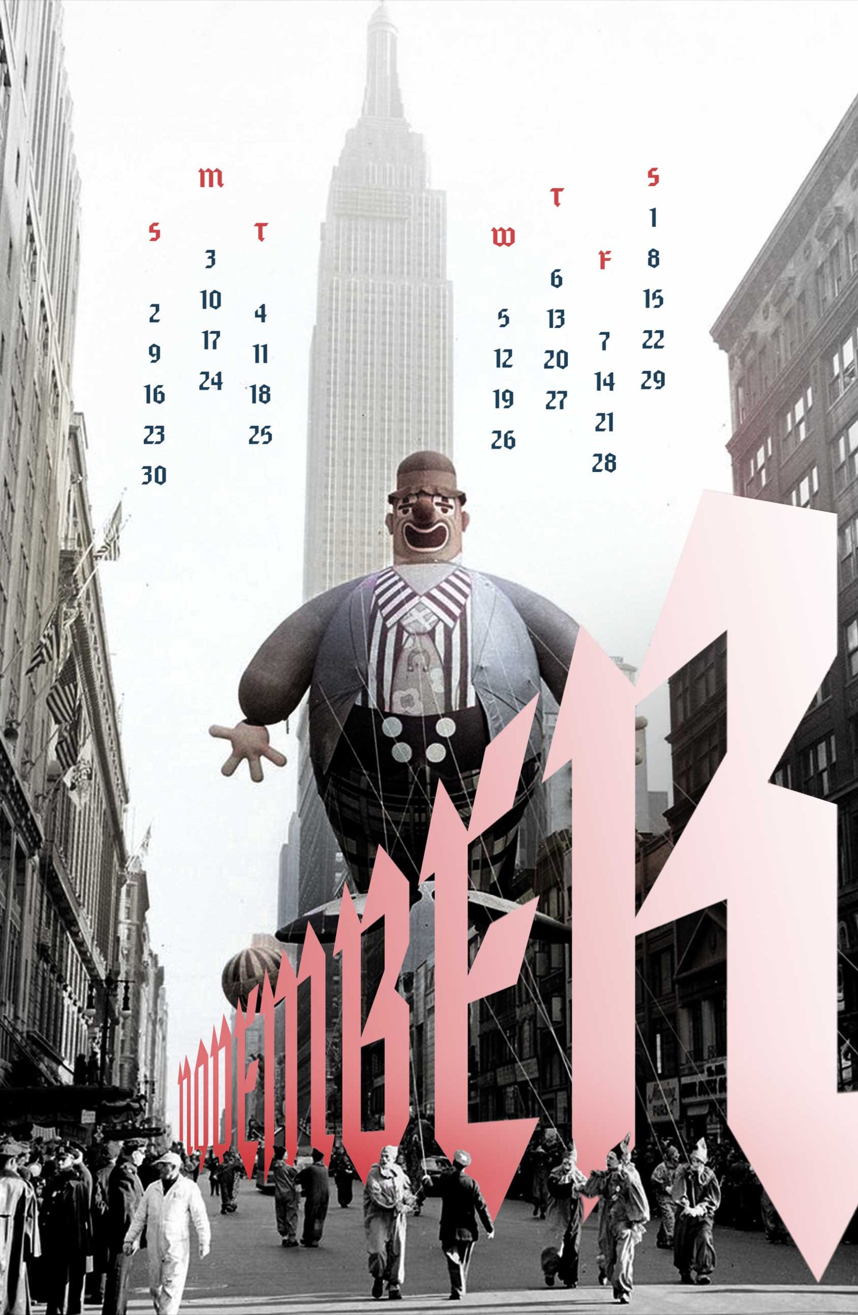
2025 Calendar: We were assigned to create a Calendar for our final project in Typography in the Spring of 2024. Given the nature of a calendar starting anew with each turn of the page to the next month, I took it as an opportunity to explore creatively. I chose a theme relating to each month and used a variety of techniques in Illustrator and Photoshop, as well as Adobe Dimension, to craft each page individually. I also experimented typographically with each page. I personally find it a little boring to turn the page on a calendar to find a slight variation in imagery on the next month. This calendar is meant to be a fresh new look at the turn of each month. Finally, as I paginated the pages for printing I needed to add an extra page. So I created the Moon Phases page to fill this need.
Click on the gallery, below, for larger images.
Motion Design
INFOGRAPHIC:
Motion Design was one of the most demanding, but also one of the most rewarding classes I’ve taken. I spent endless hours working on each project for this course. But this is something I’ve wanted to learn for a long time.
The first video was an infographic assignment. I use to work for the Iowa Department of Natural Resources as an Art Director. In that role I learned a lot about Iowa’s land and land usage. I chose to delve into this subject matter for my infographic. This was a fun piece. It made me learn a lot of small techniques to pull it off correctly.
TITLE SEQUENCE:
In this Motion Design project we were assigned to create a Title Sequence. I’m always looking for practical application of my course work. In this instance I wanted to tie it into the wayfinding signage system I planned to develop for my Capstone project. This video is meant to introduce people to some of the problems on the trail (as characters), then introduce the people involved in creating solutions for the issues. It was fun finding music and sound effects to fit the correct mood for the piece as well.
Experimental Interaction
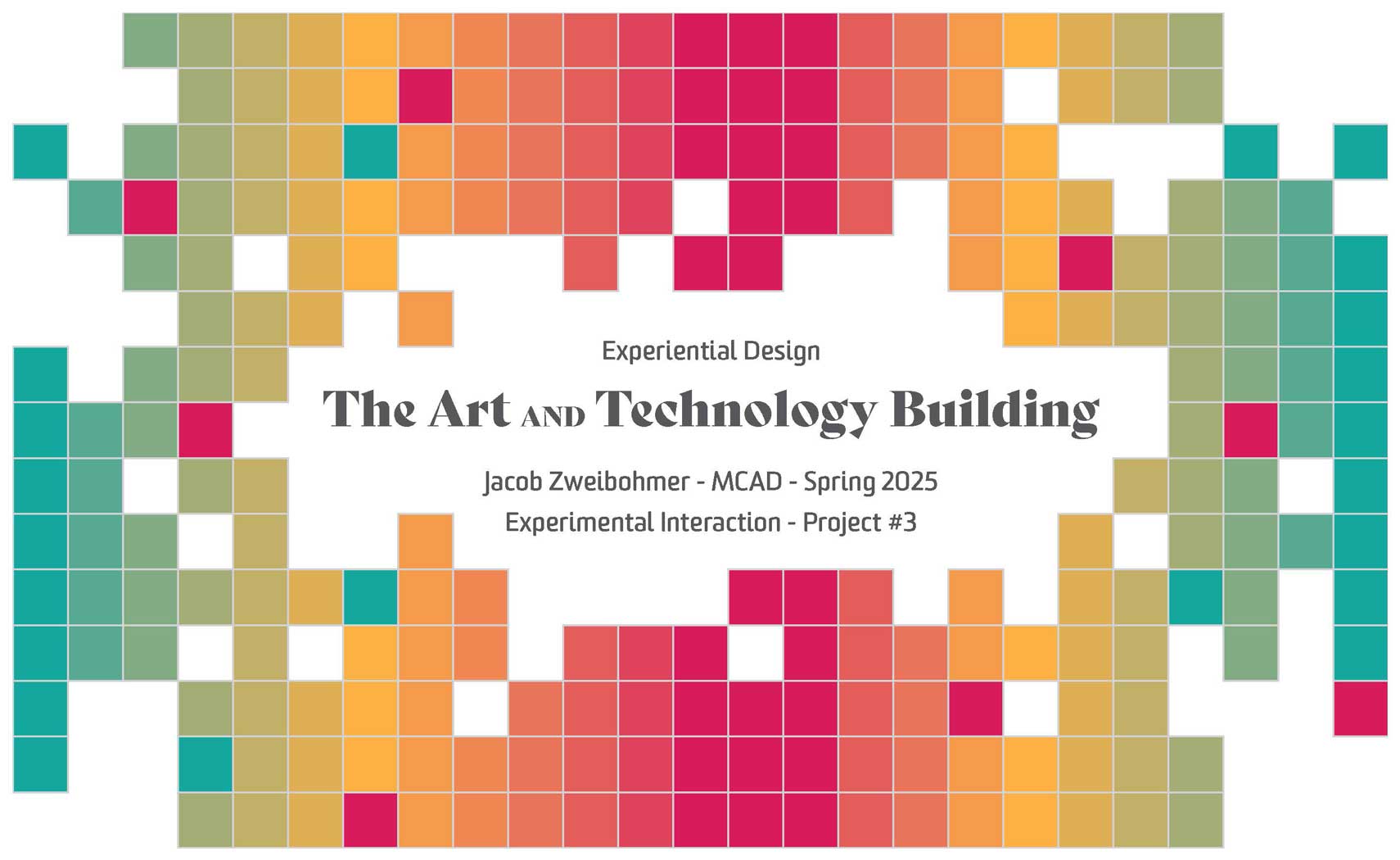
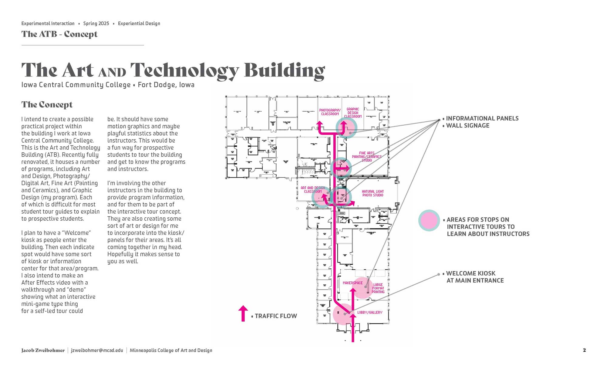
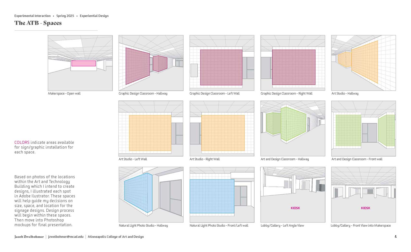
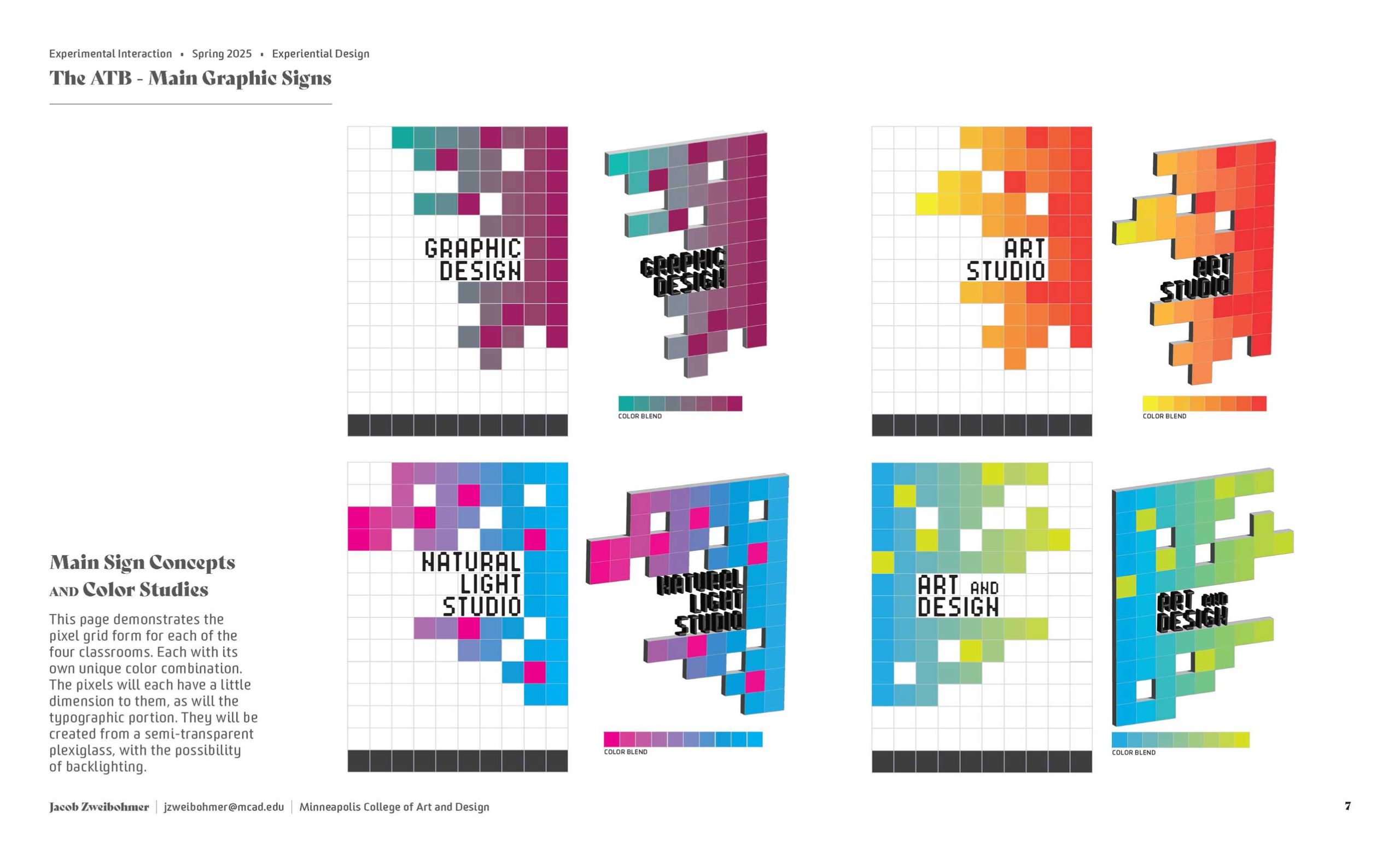
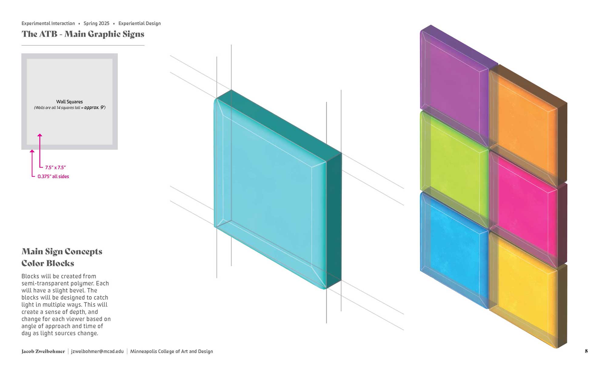
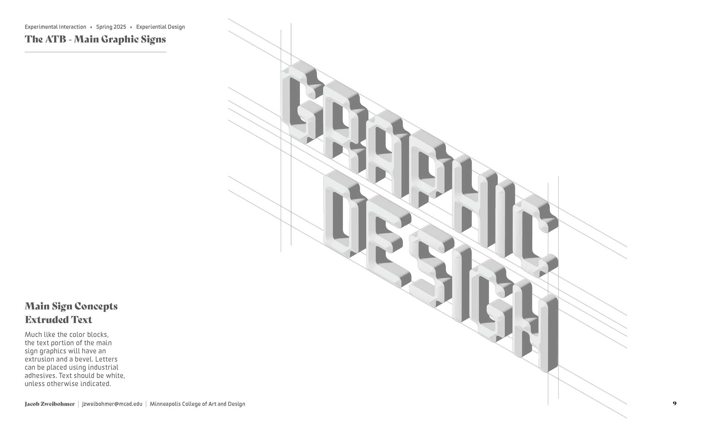
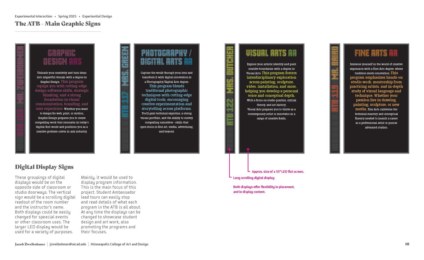
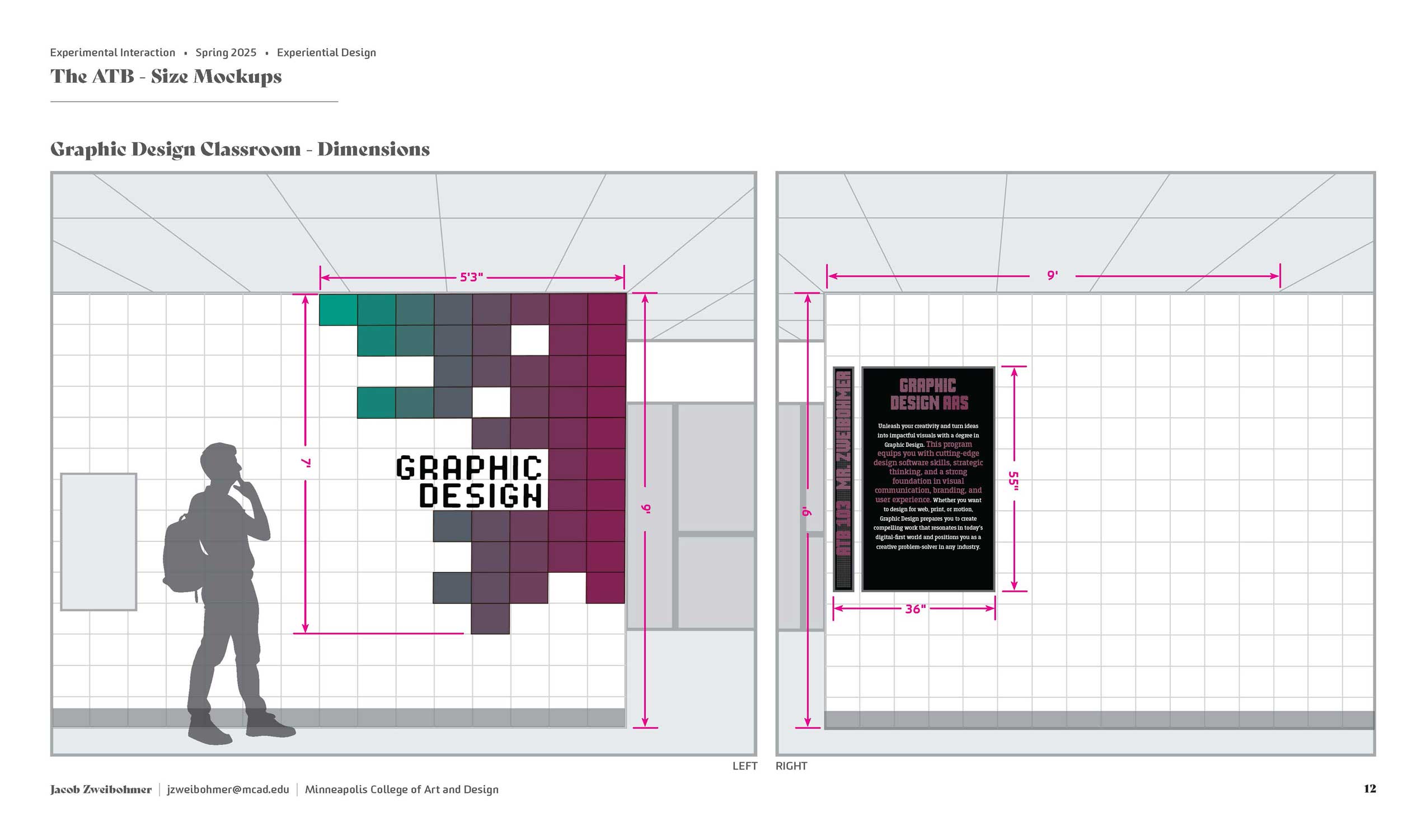
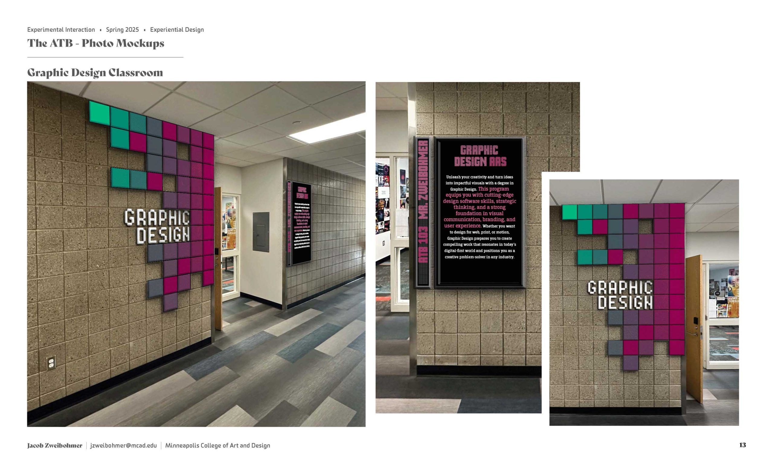
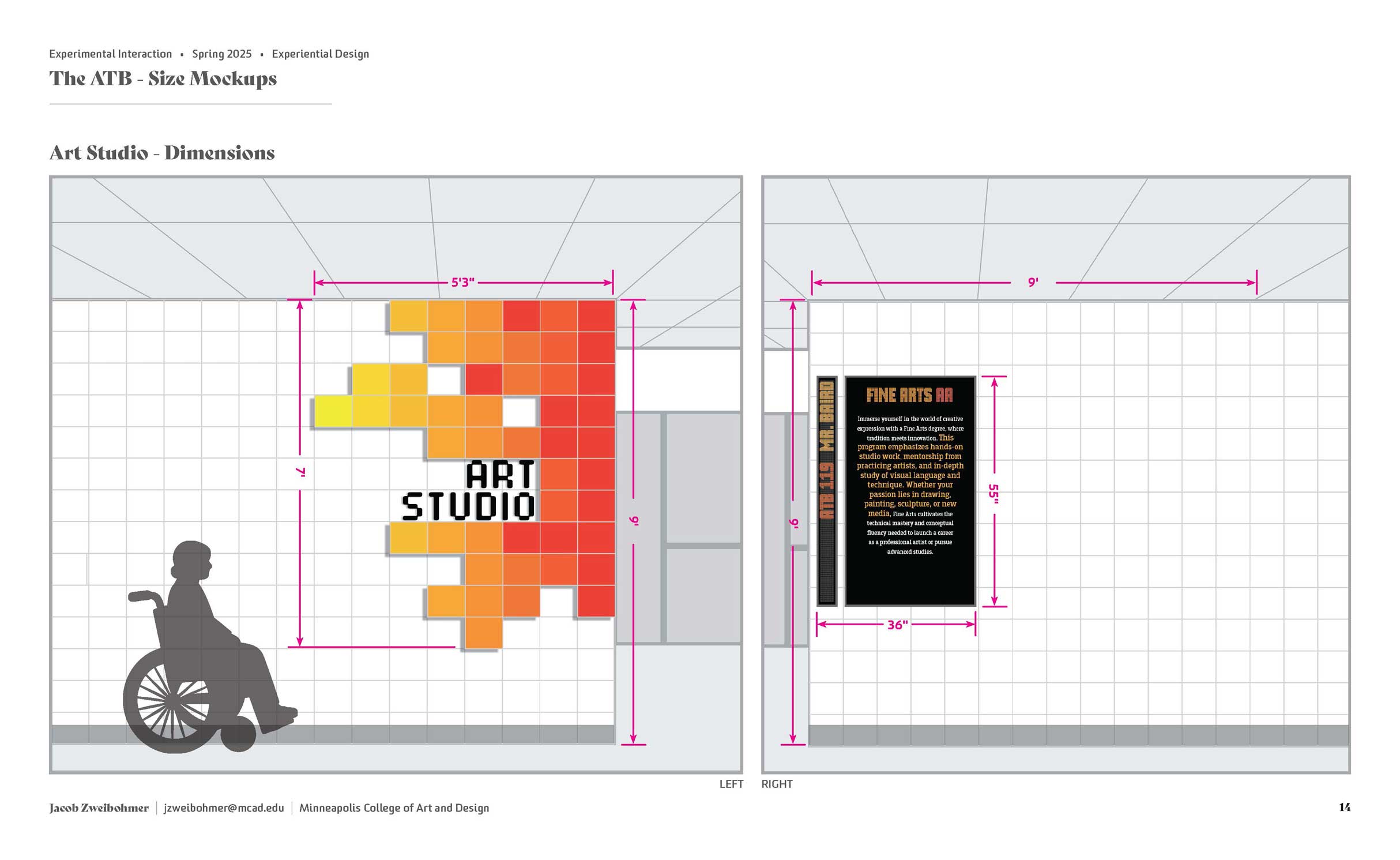
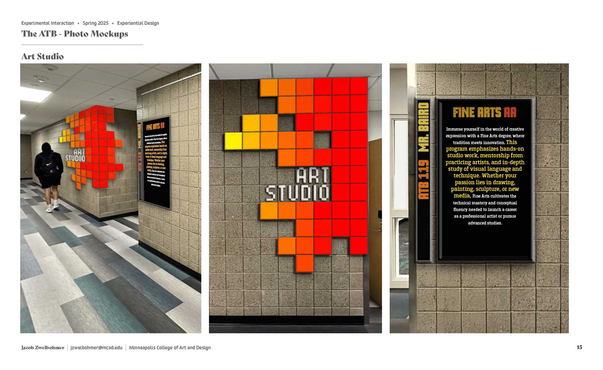
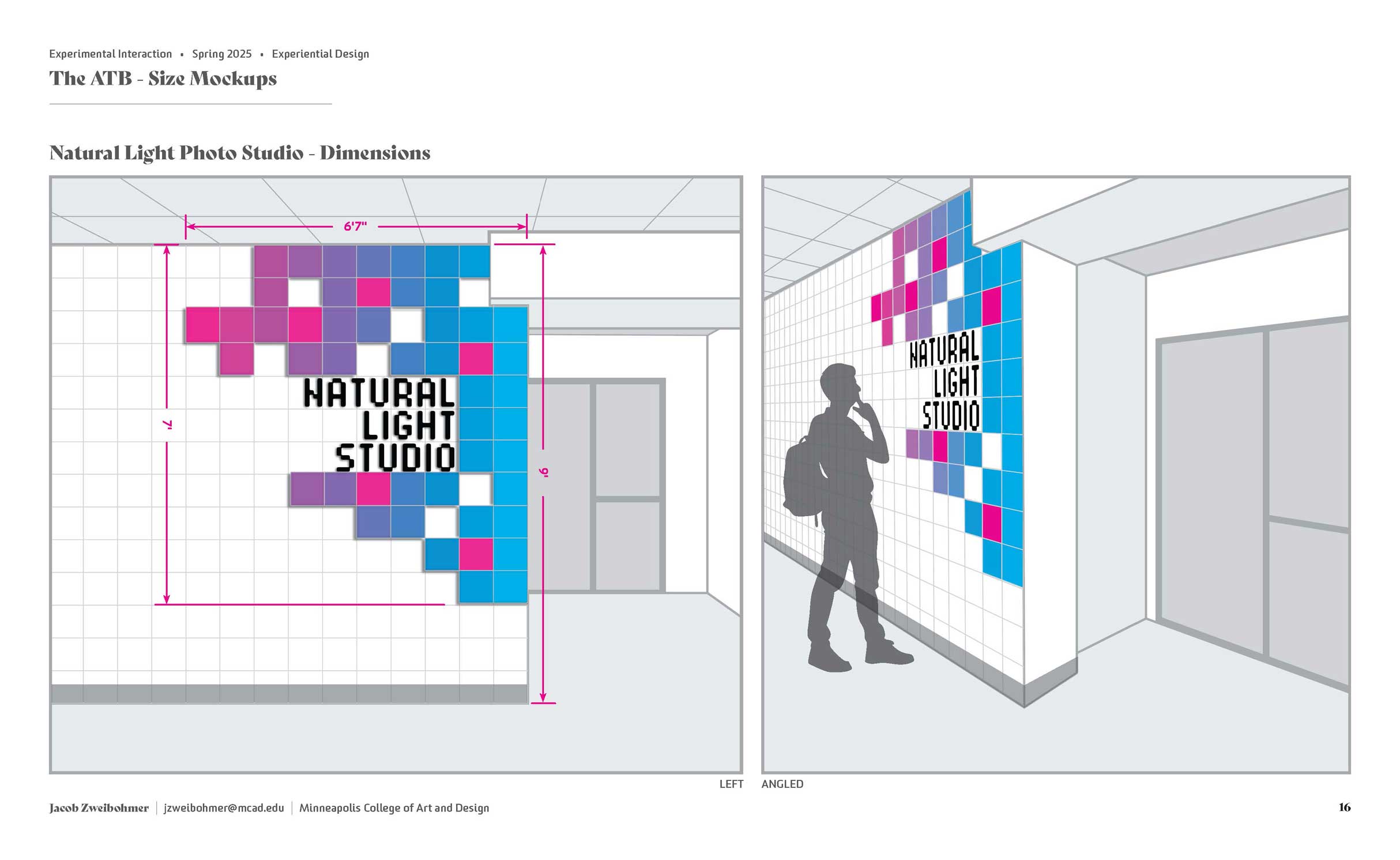
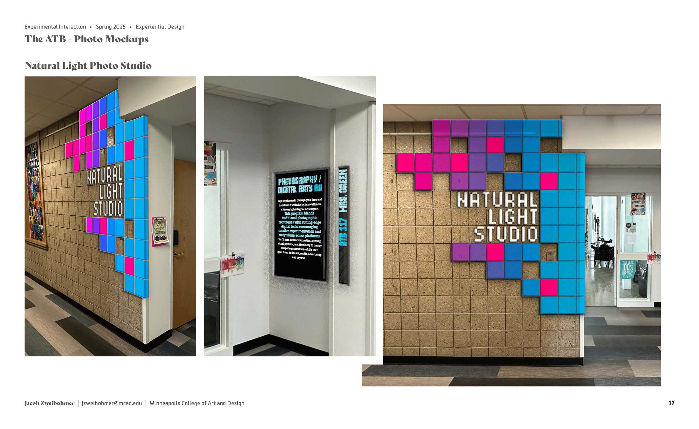
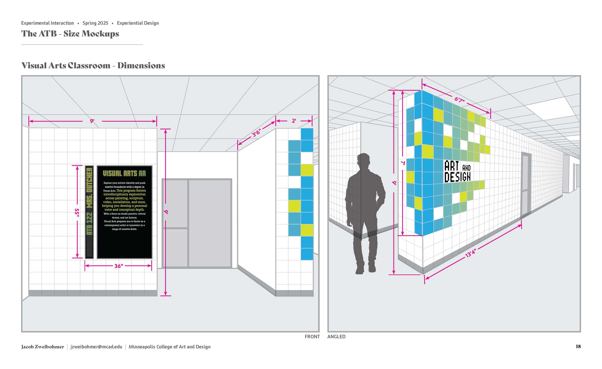
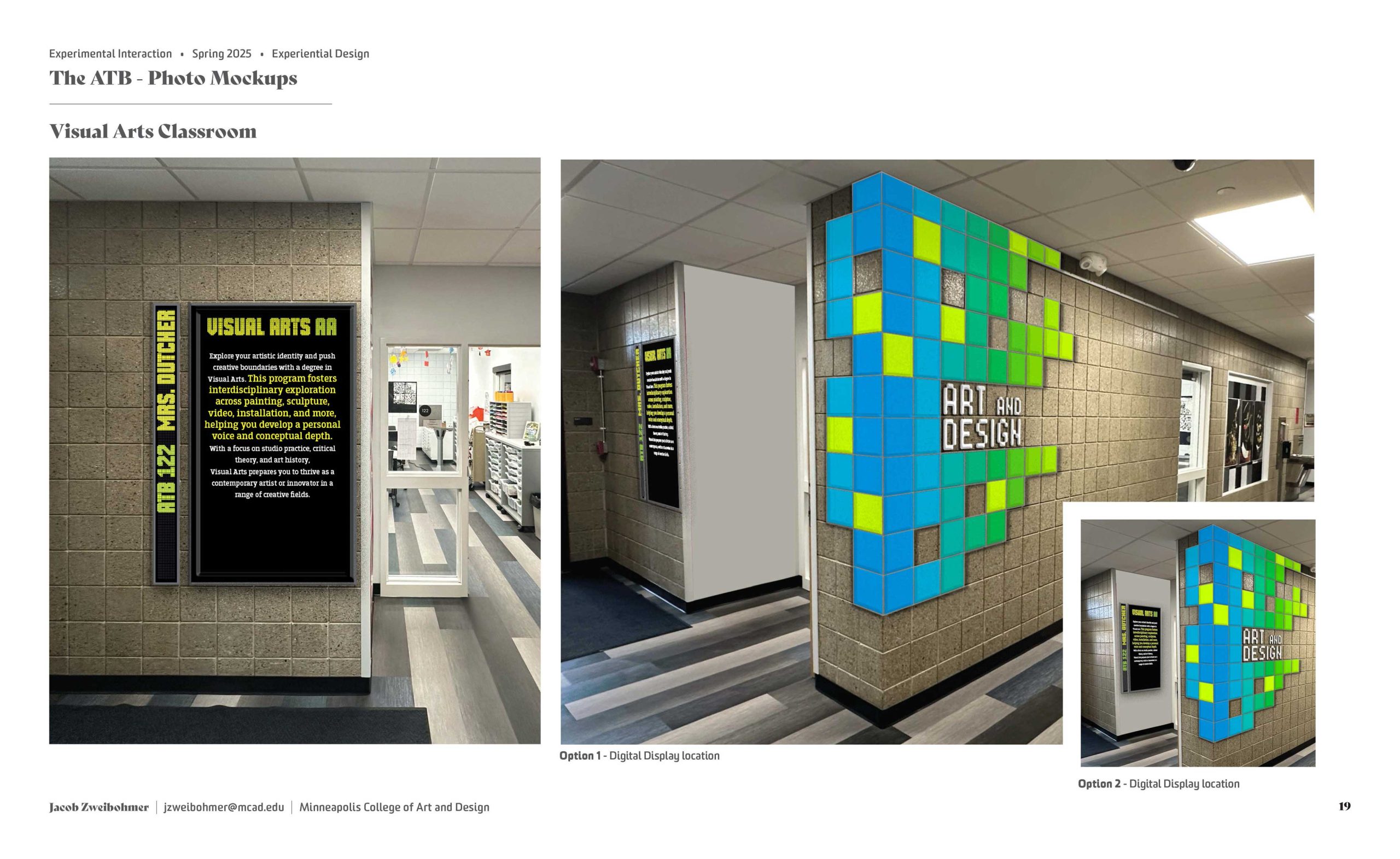
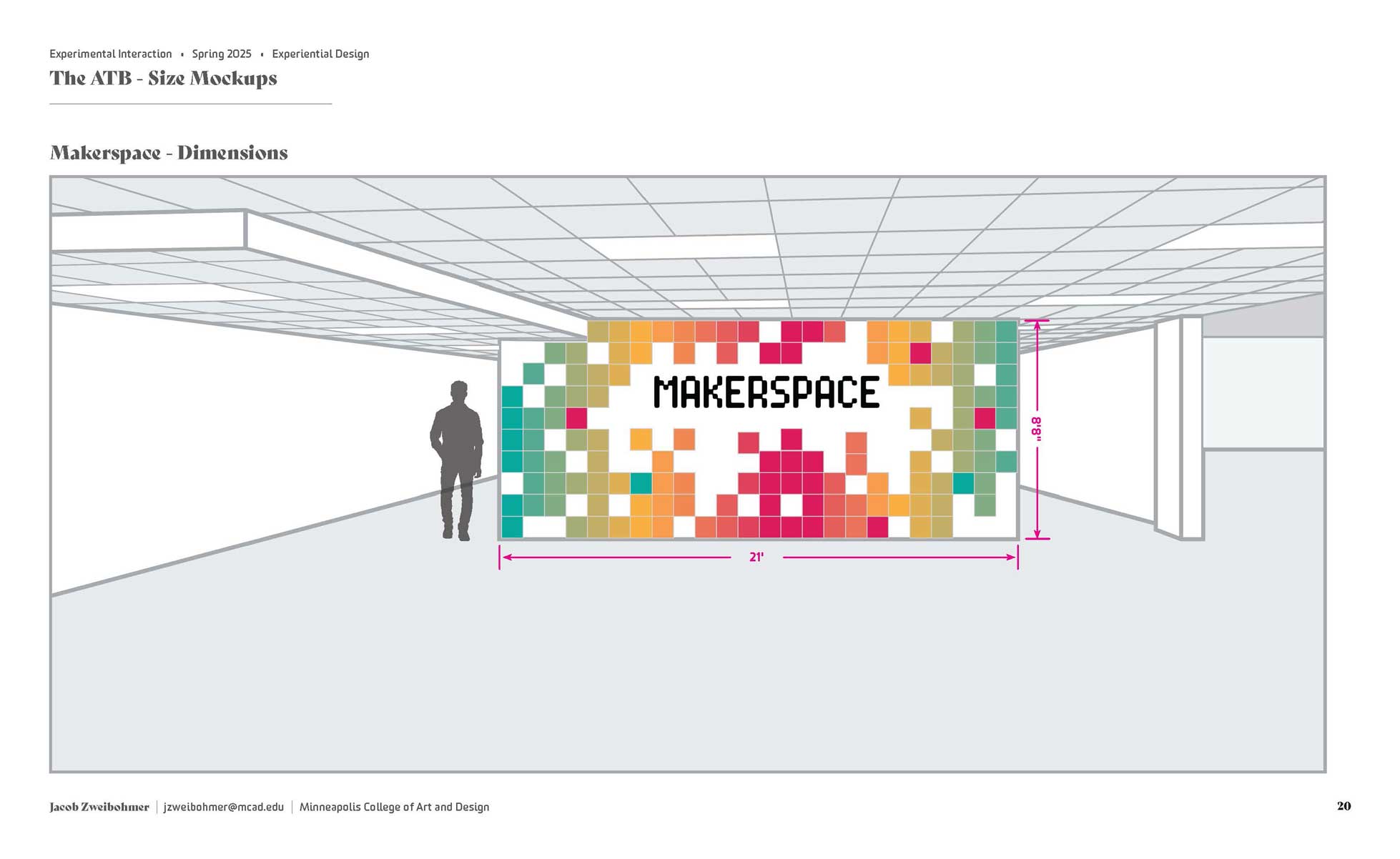
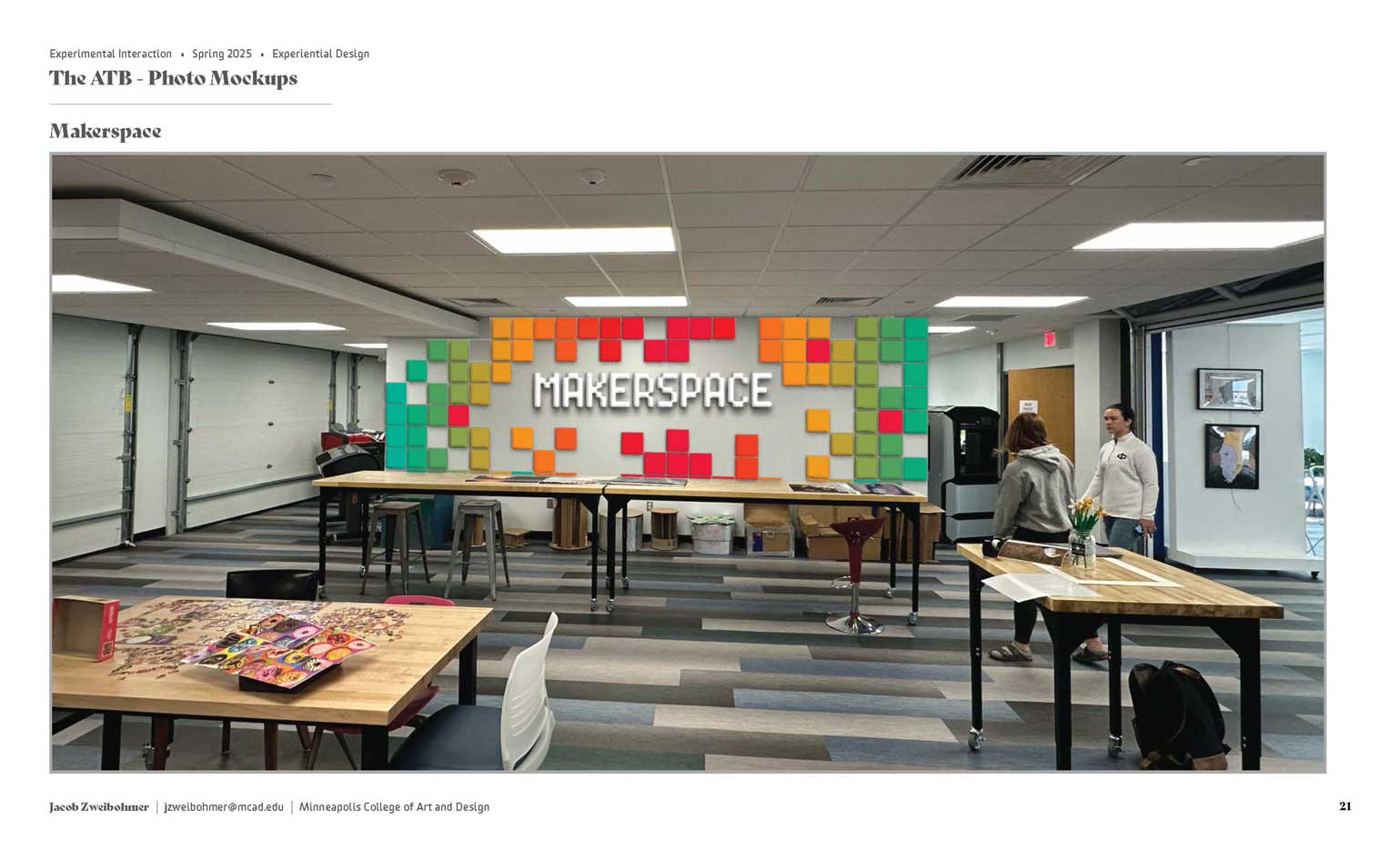
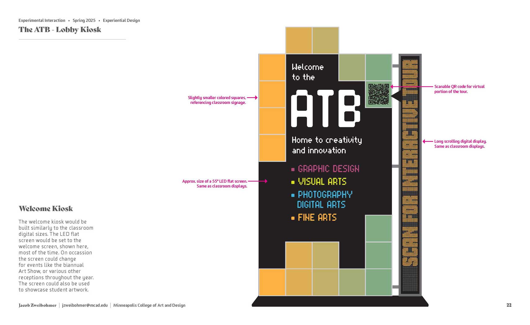
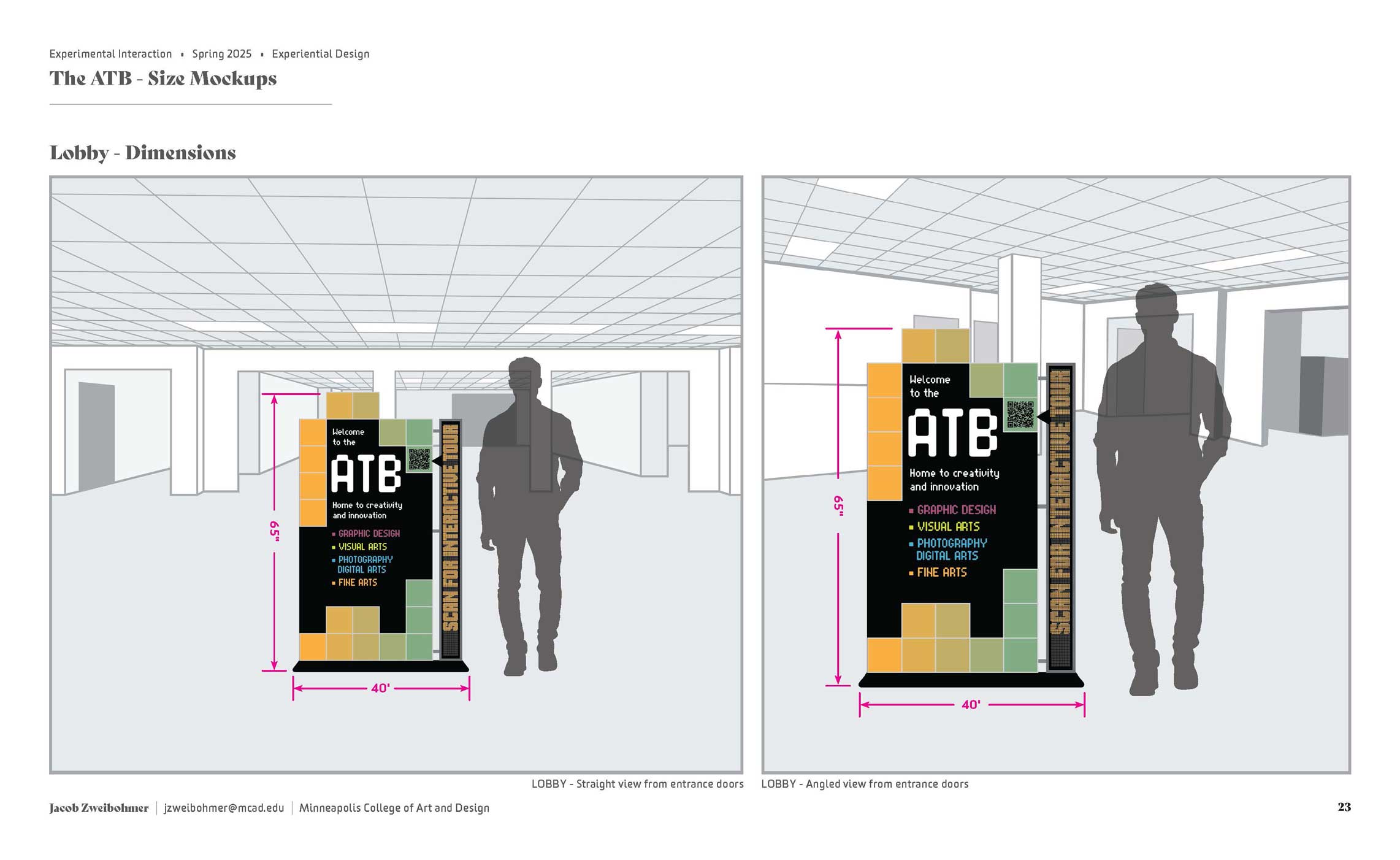
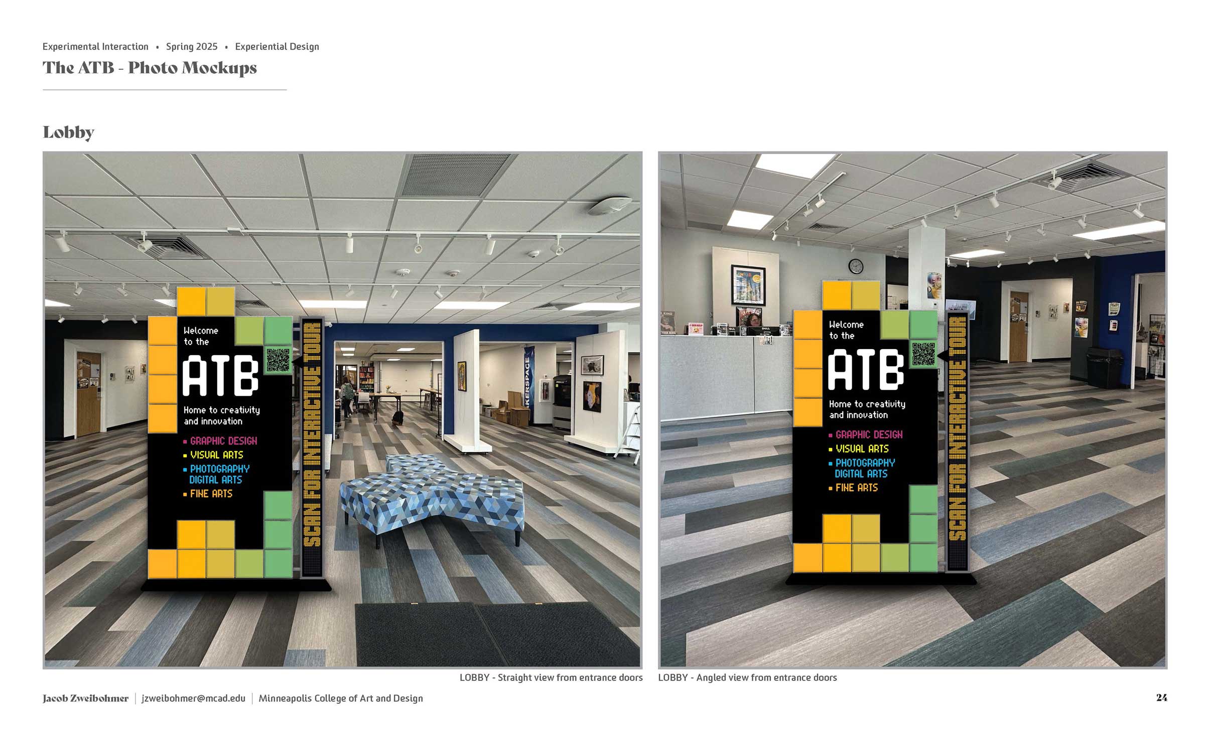
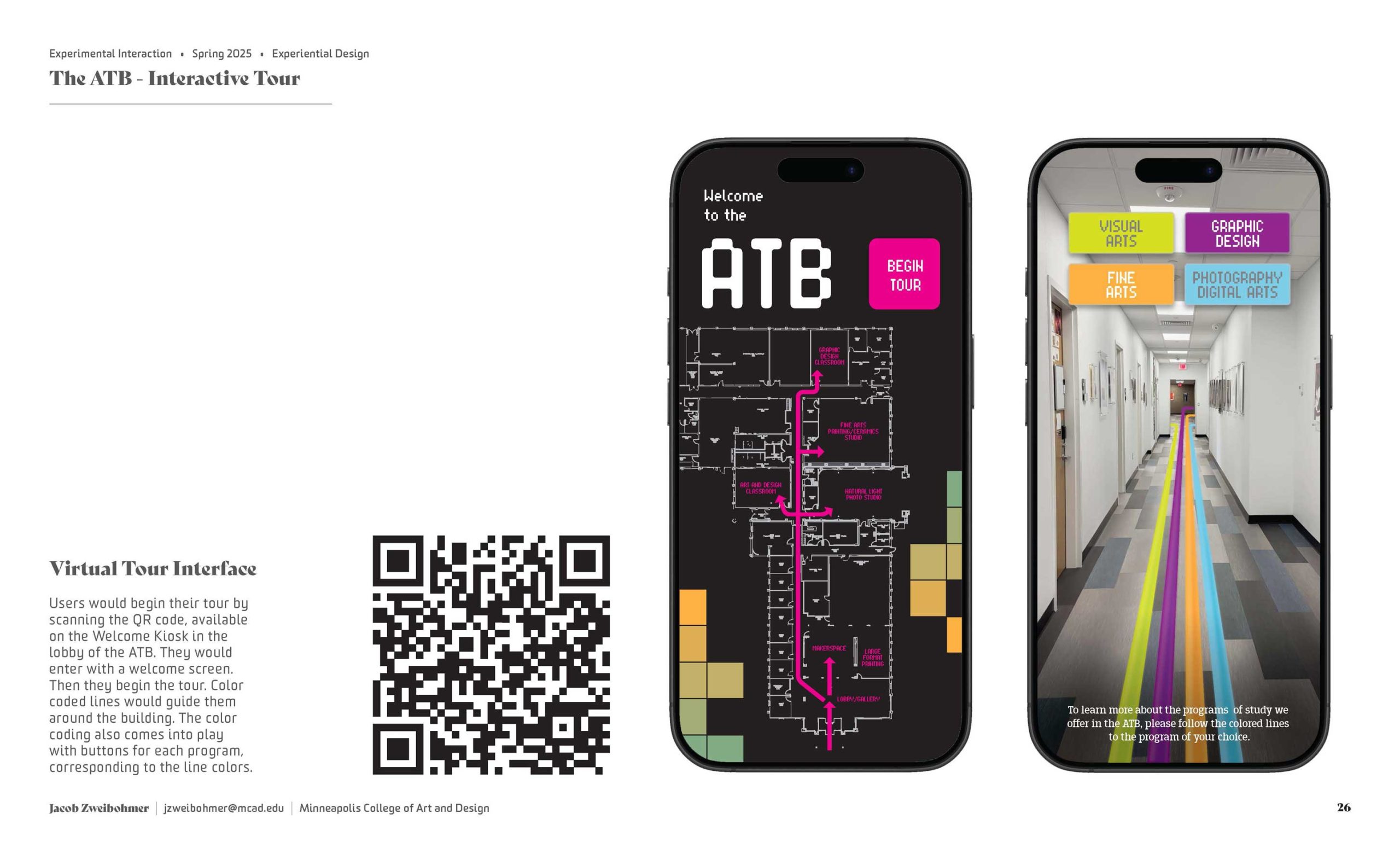
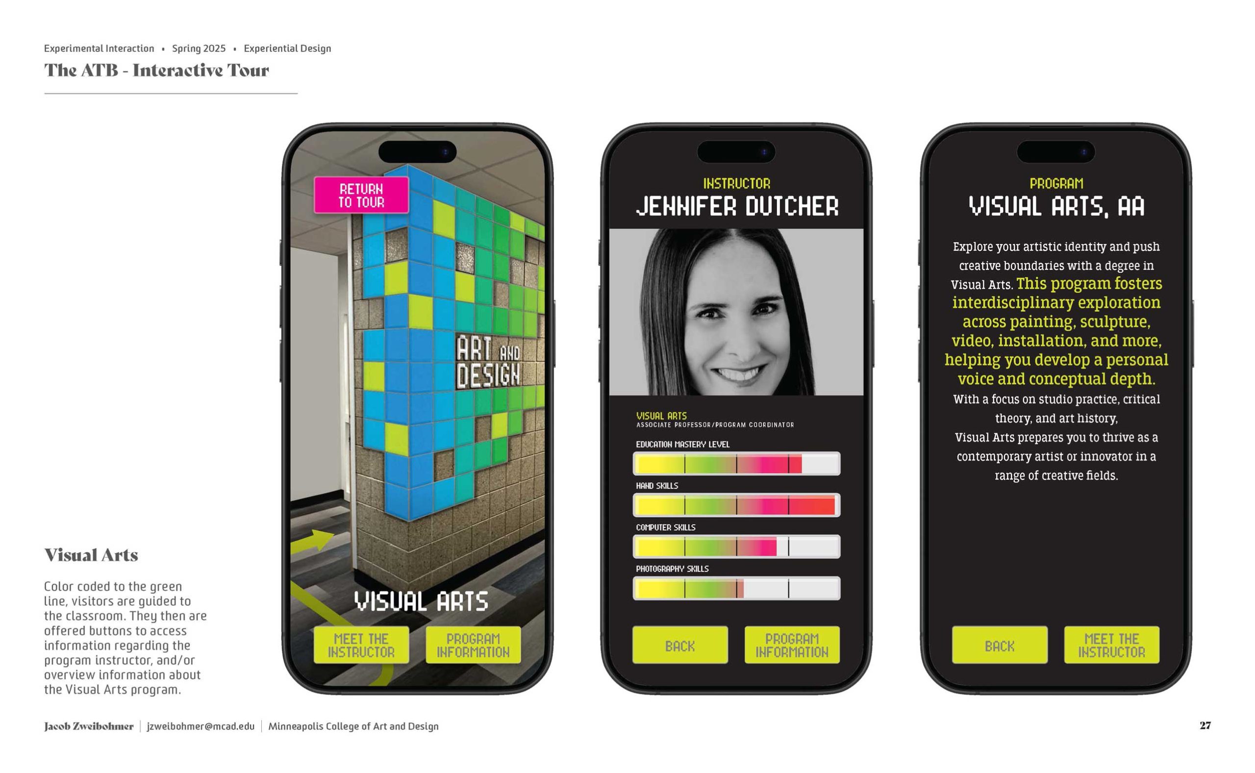
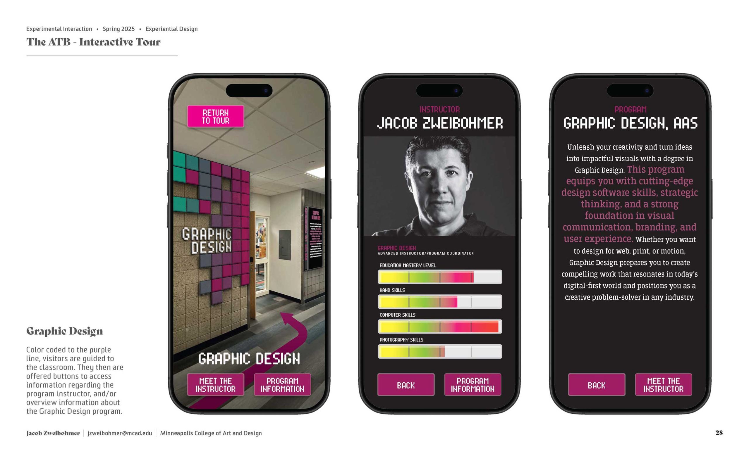
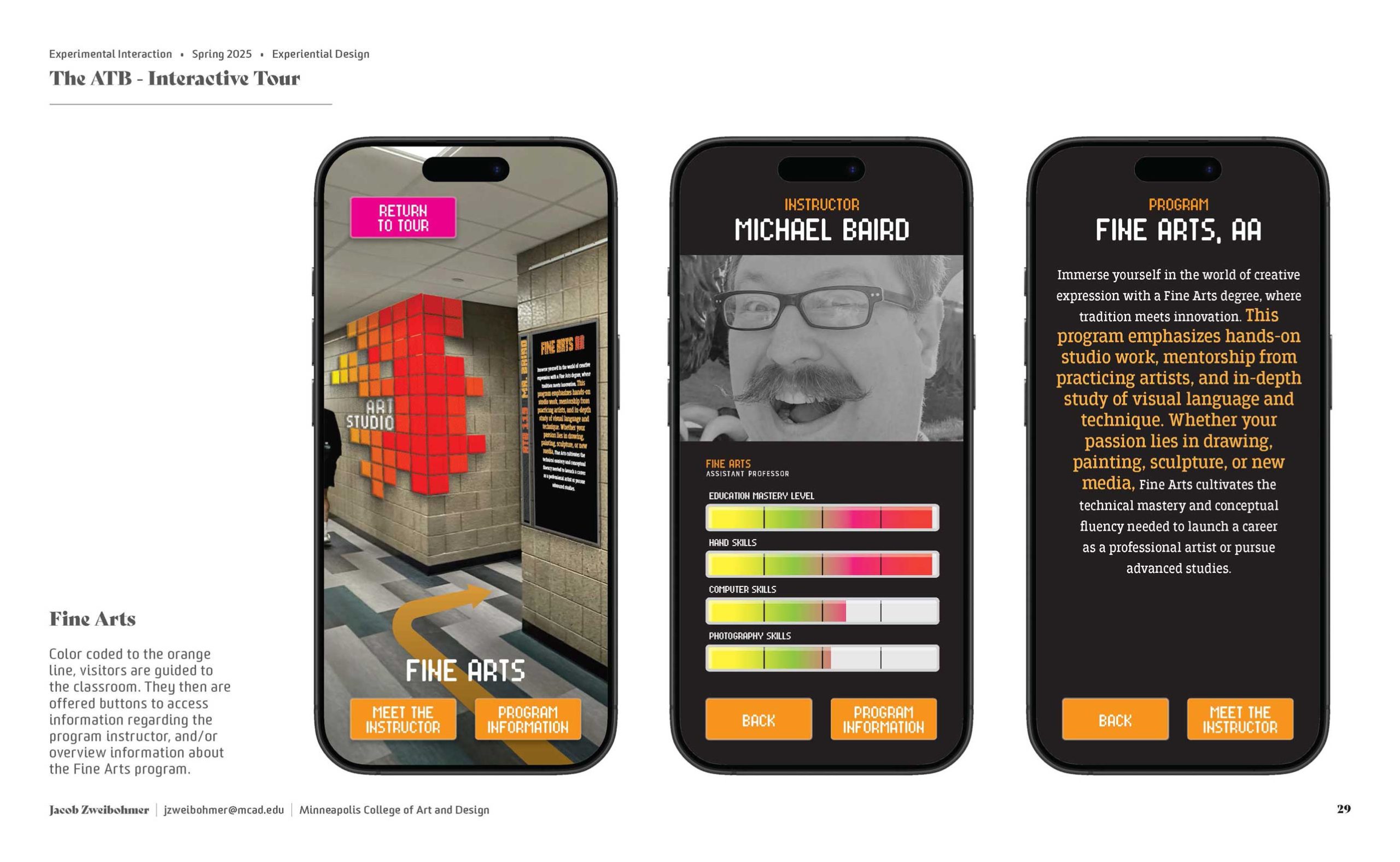
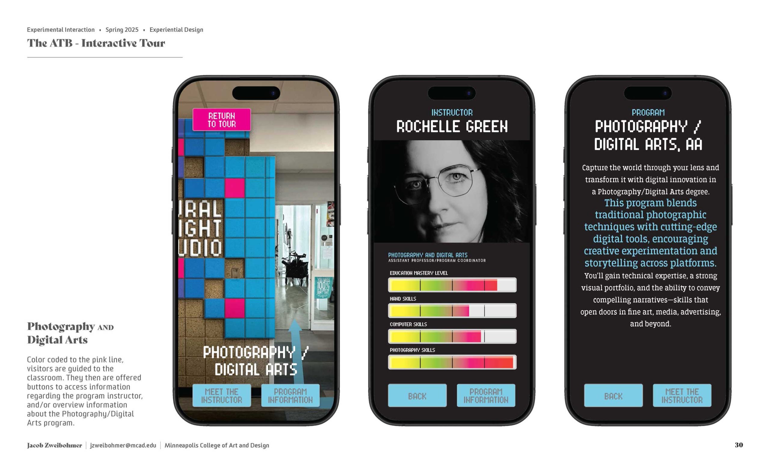
The Art and Technology Building Sign and Information System: For this Experiential Design project in Experimental Interaction in Spring of 2025 I chose to use the building I work in at Iowa Central Community College as my subject. I teach Graphic Design, but there are several programs housed in this Art and Technology Building (ATB). These include Visual Arts, Photography/Digital Arts, and Fine Arts. Often times student ambassador led tours are not entirely accurate in their explanations of each program. So, I created a sign system to include more information.
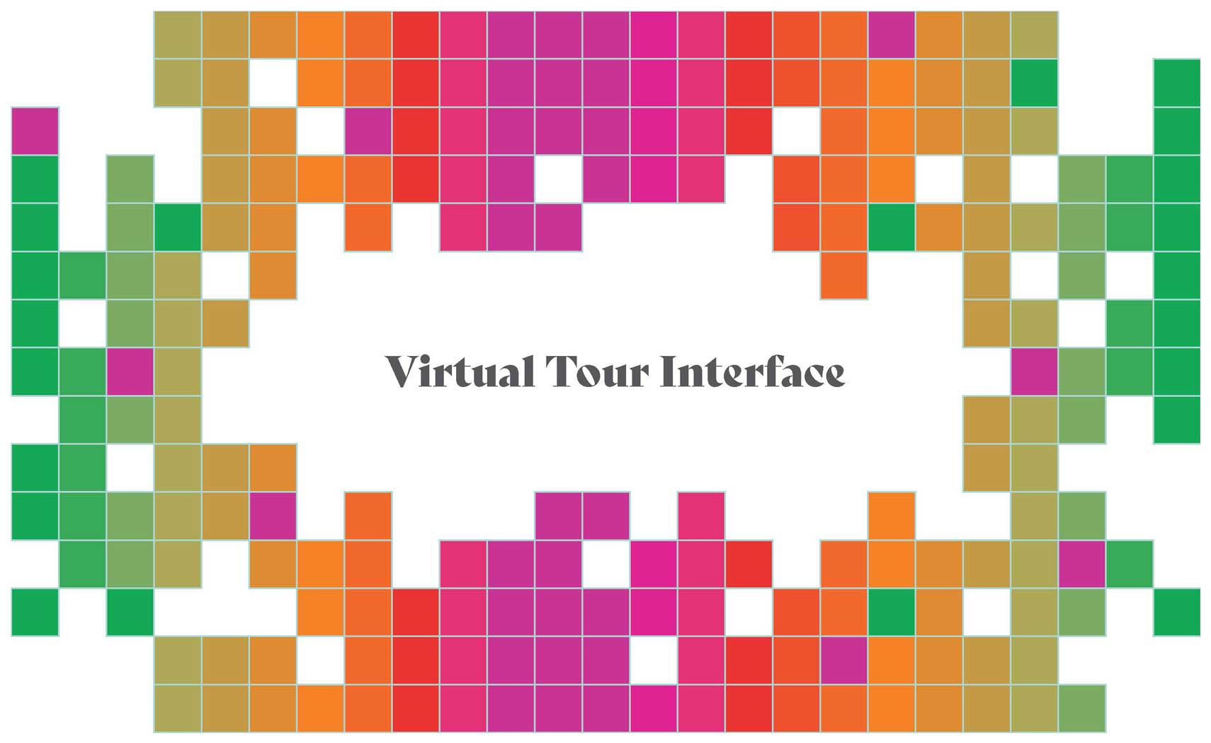
The gridded blocks are meant to represent pixels. Something demonstrating a commonality in each program. They are uniquely identified by a color system. To further help explain each program, there are digital boards next to each classroom which will scroll information on each program as well as showcase student created work. An app was also proposed, but not developed, to act as a self-guided tour. The app would be activated by a QR code. Scannable at the welcome sign at the front doors.
Click on the gallery, below, for larger images.
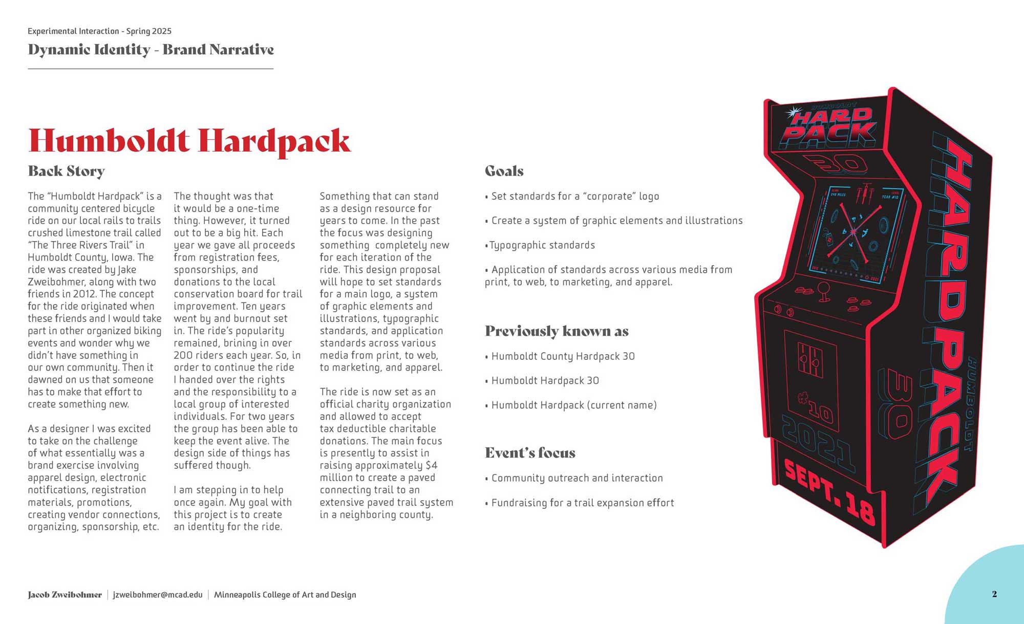
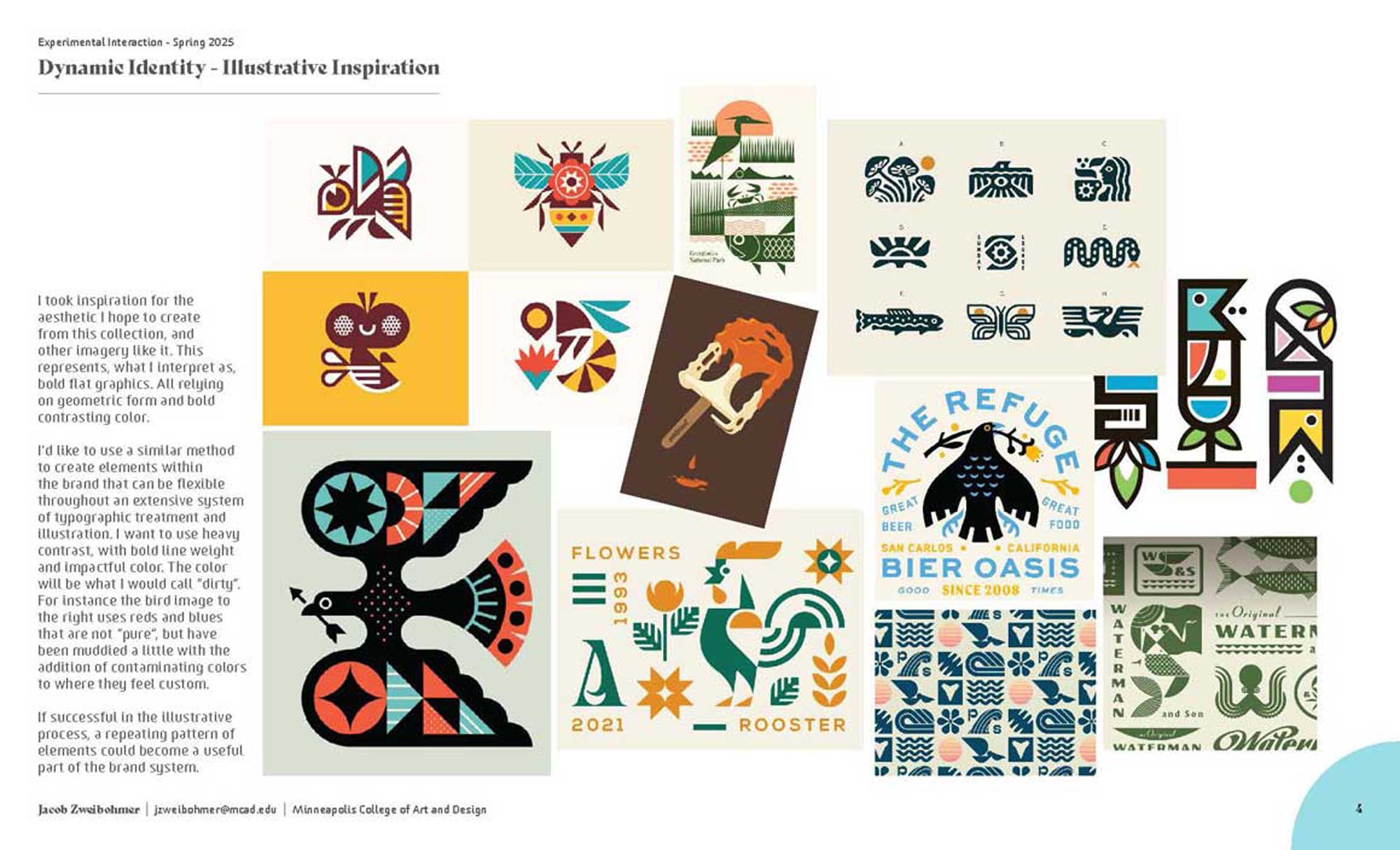
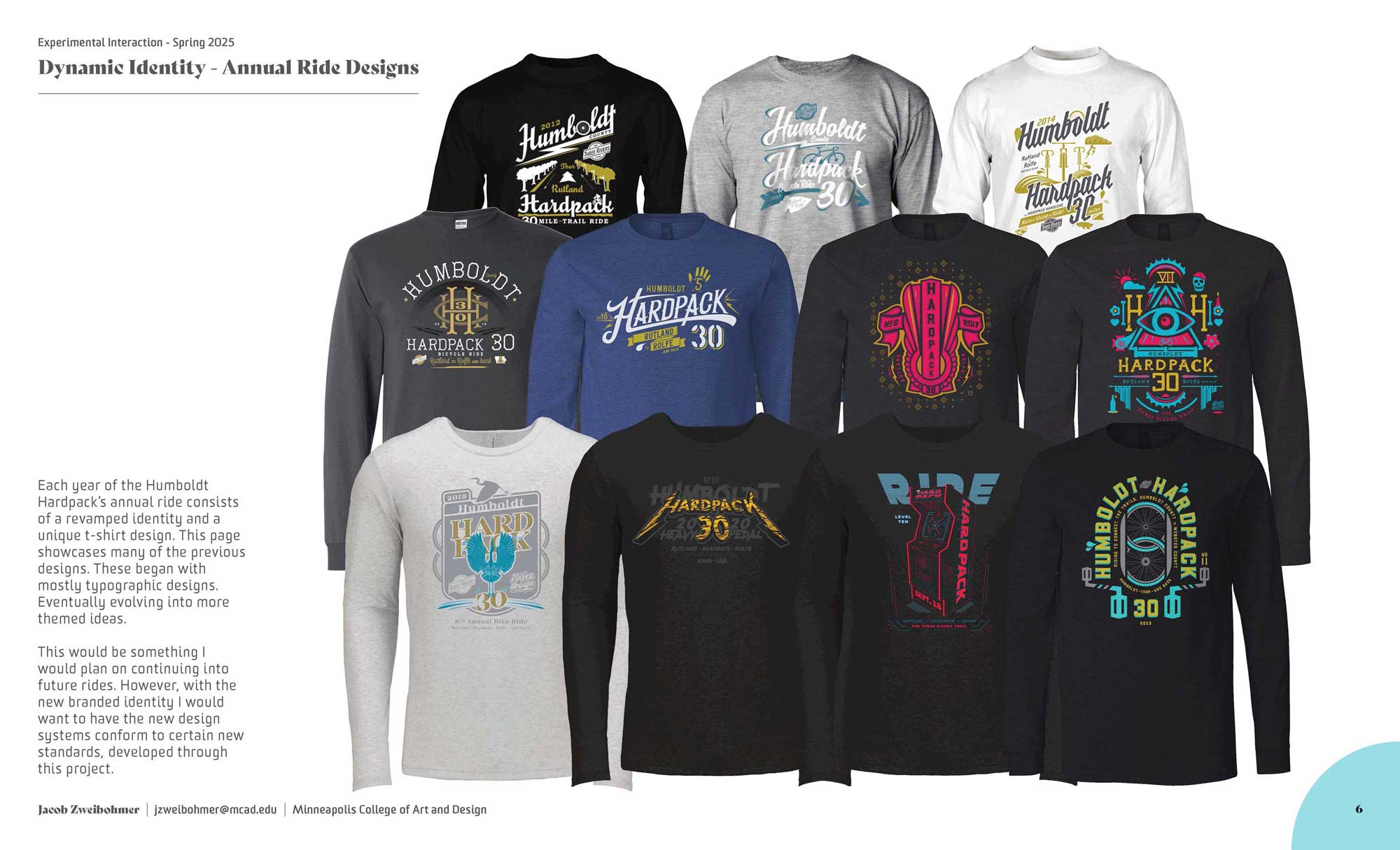
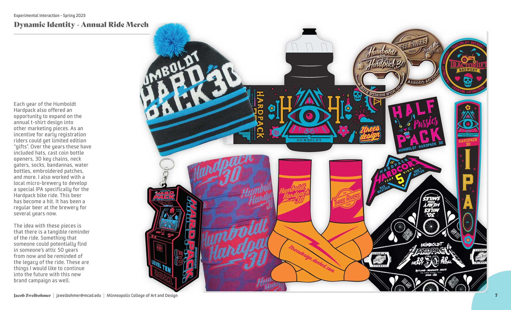
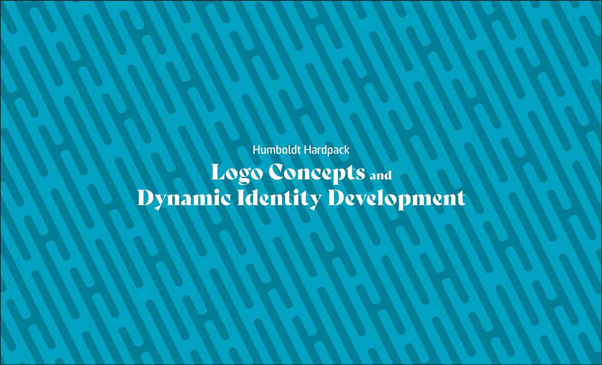
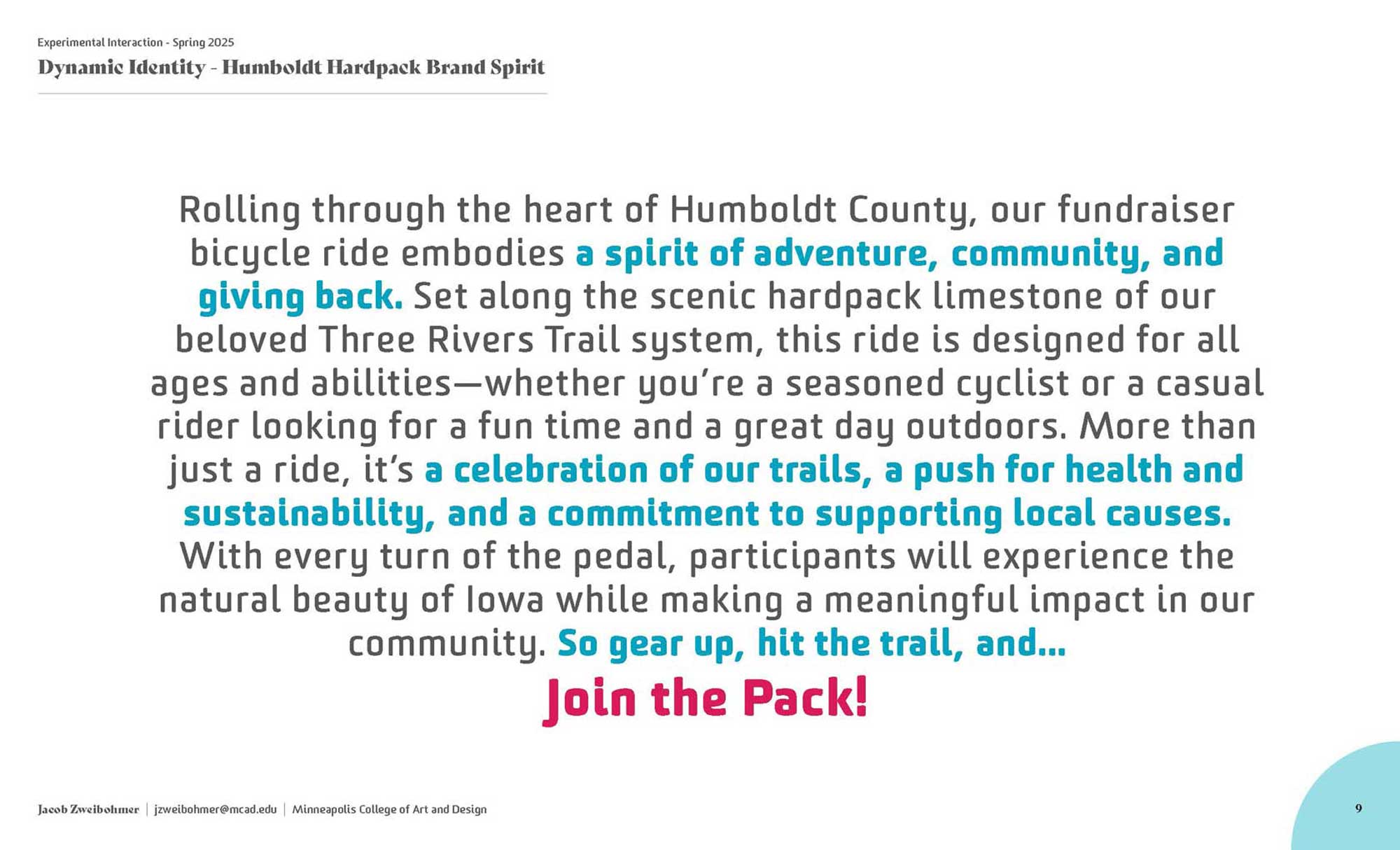
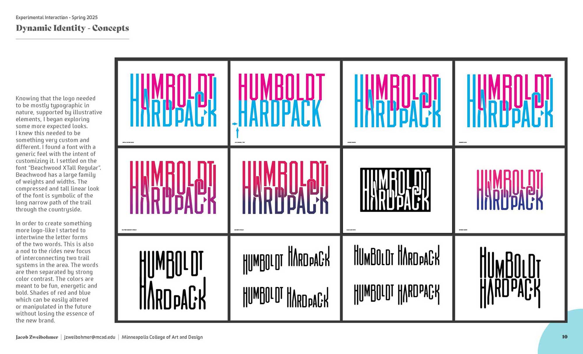
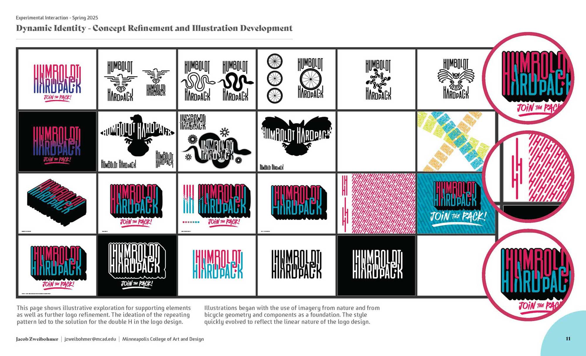
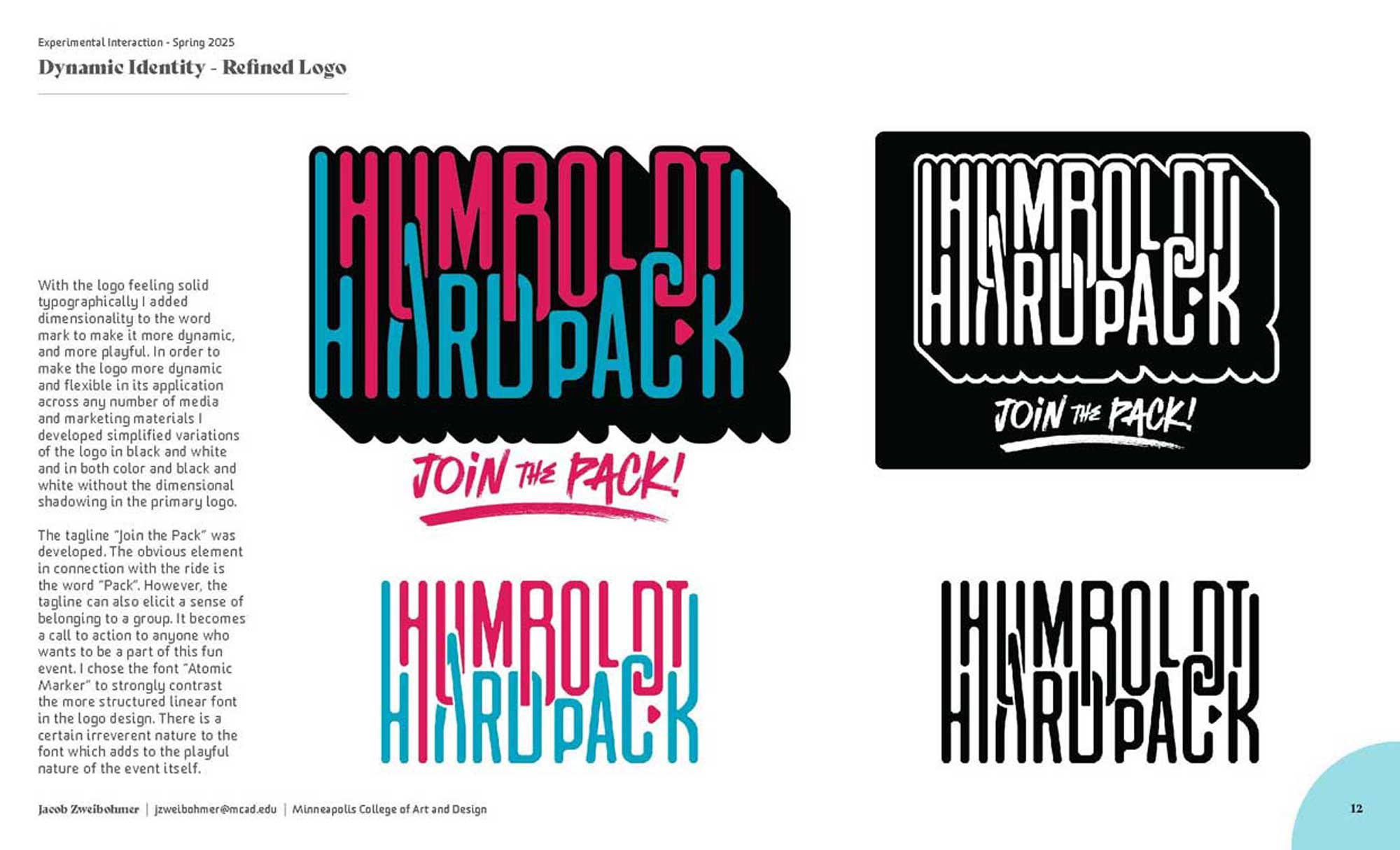
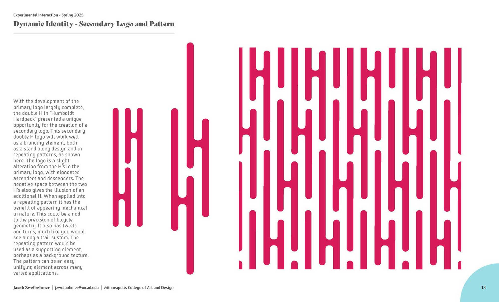
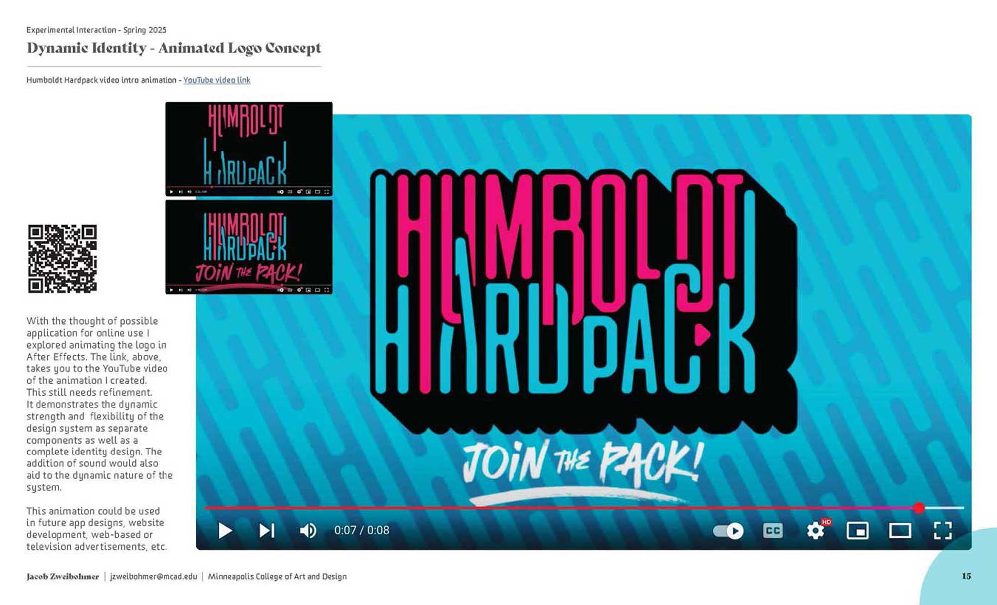
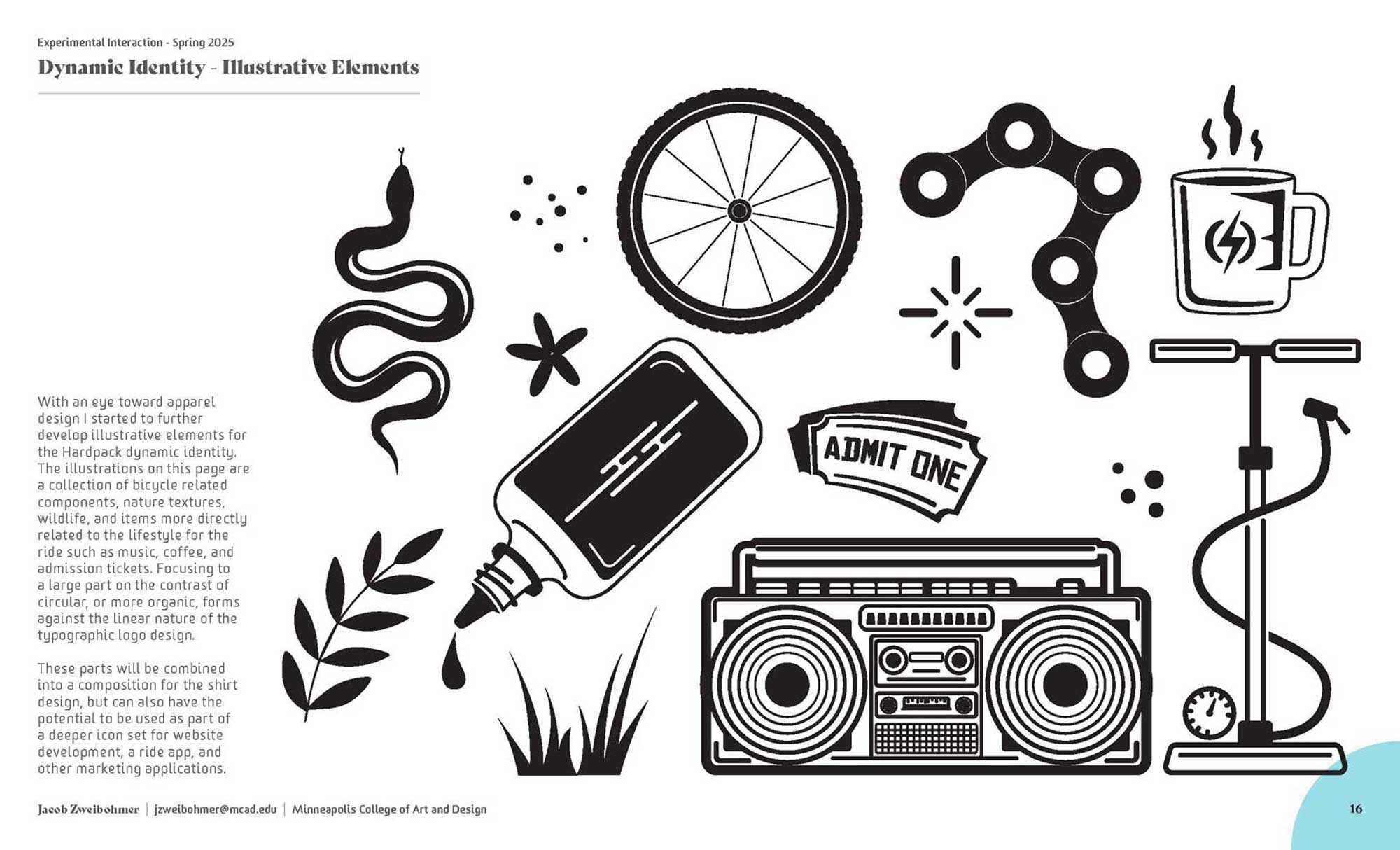
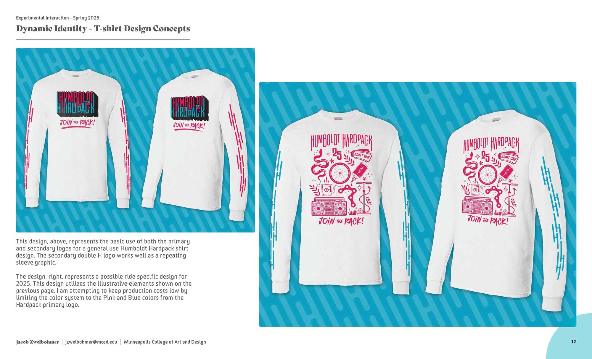
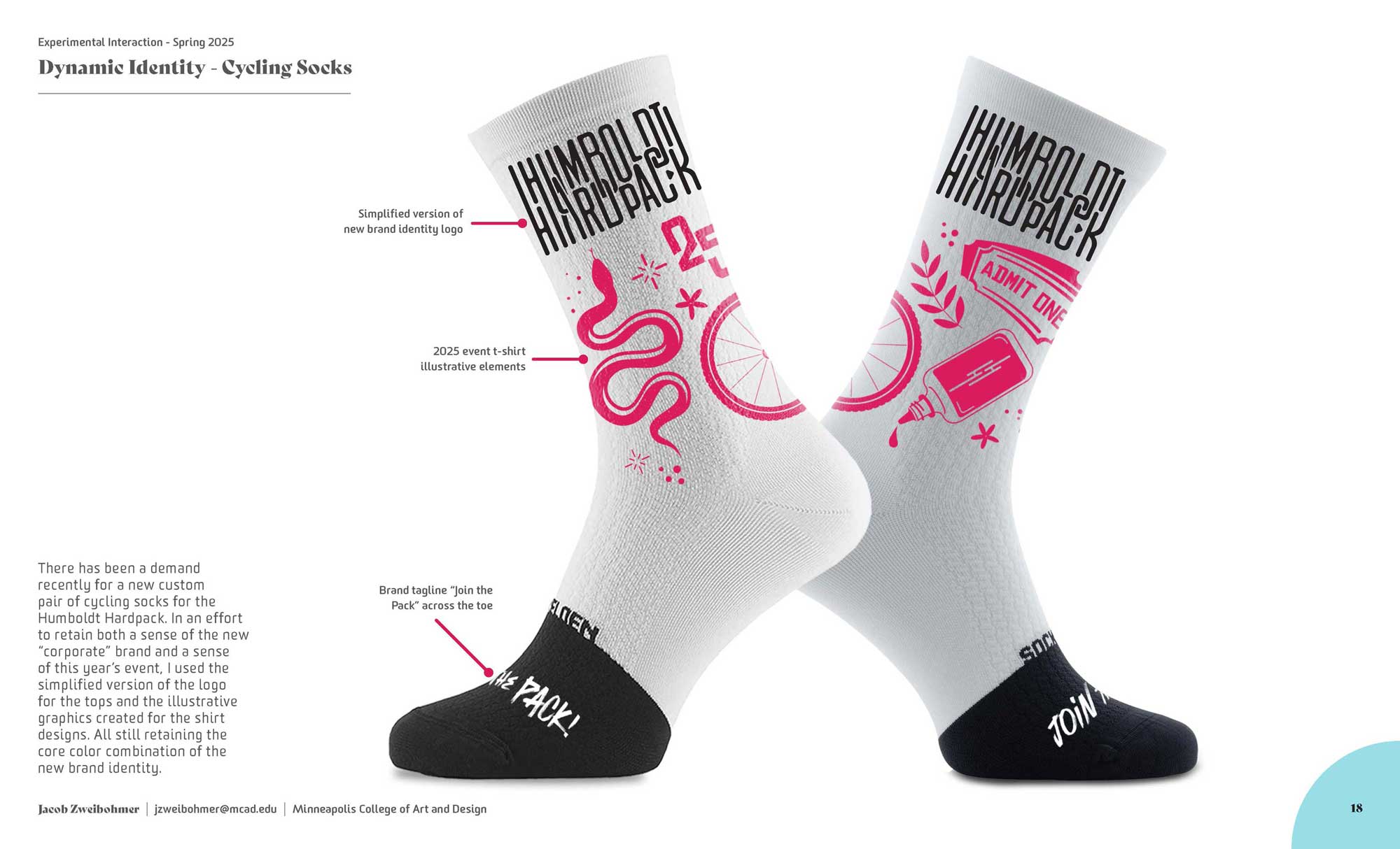
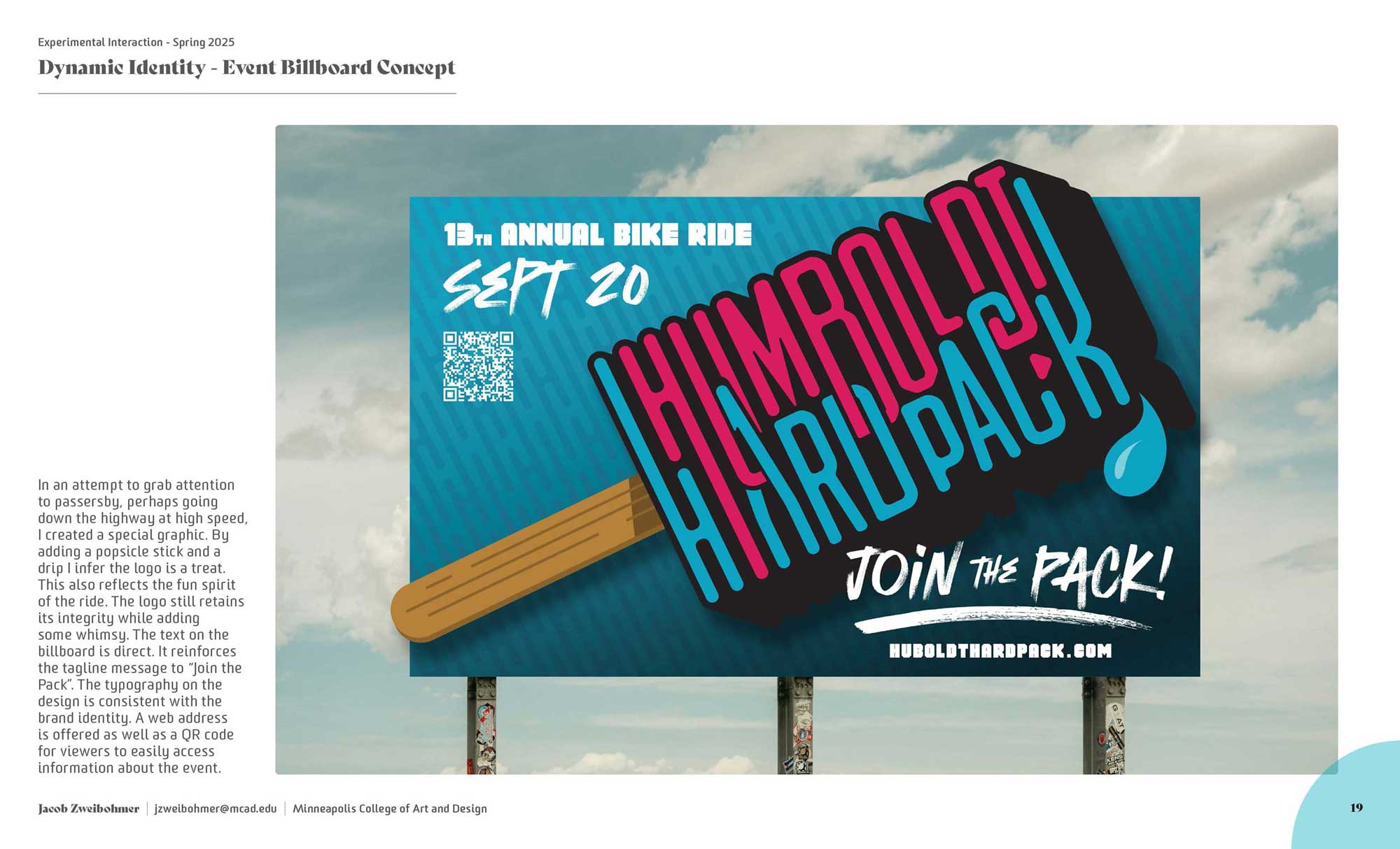
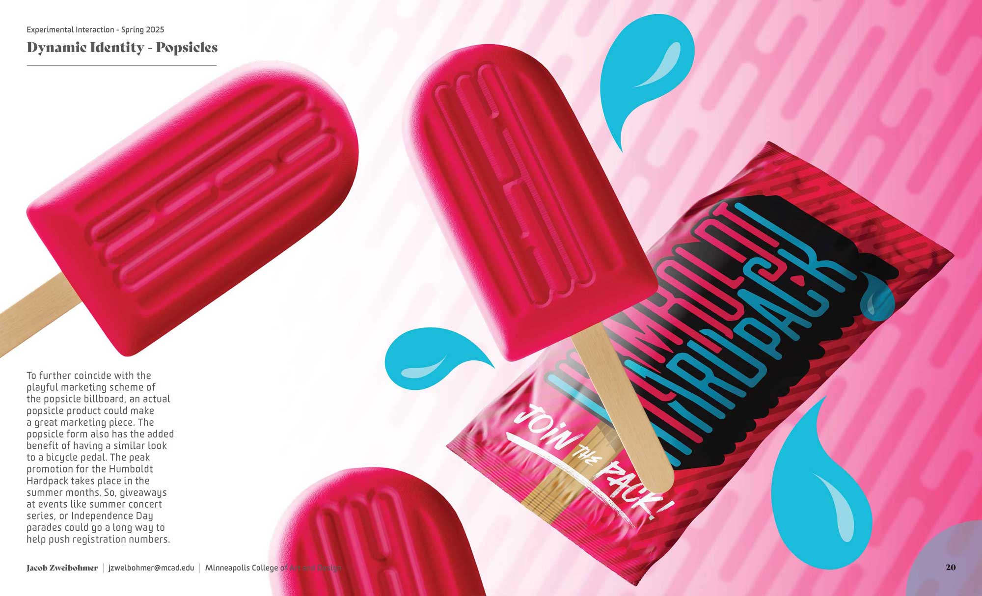
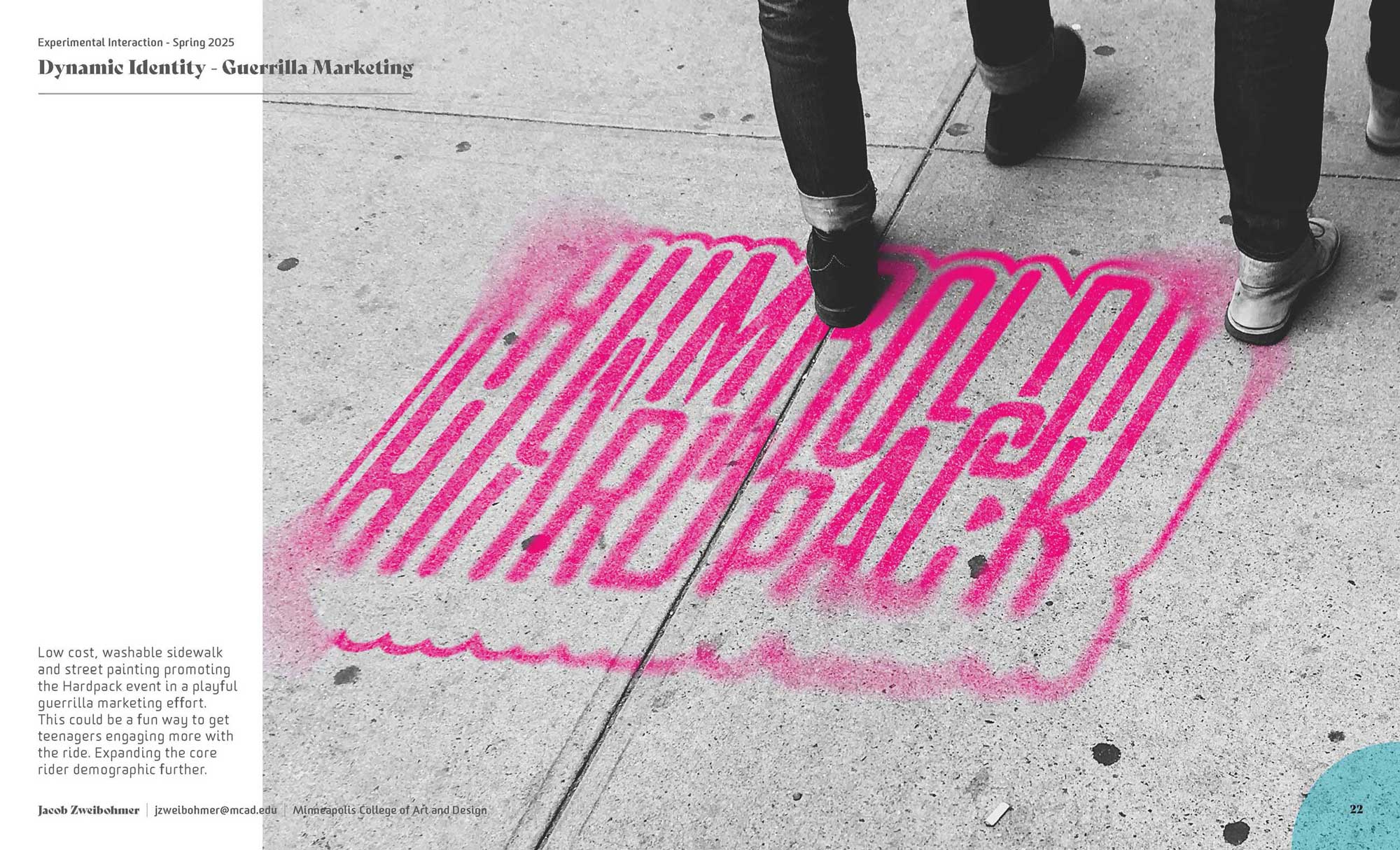
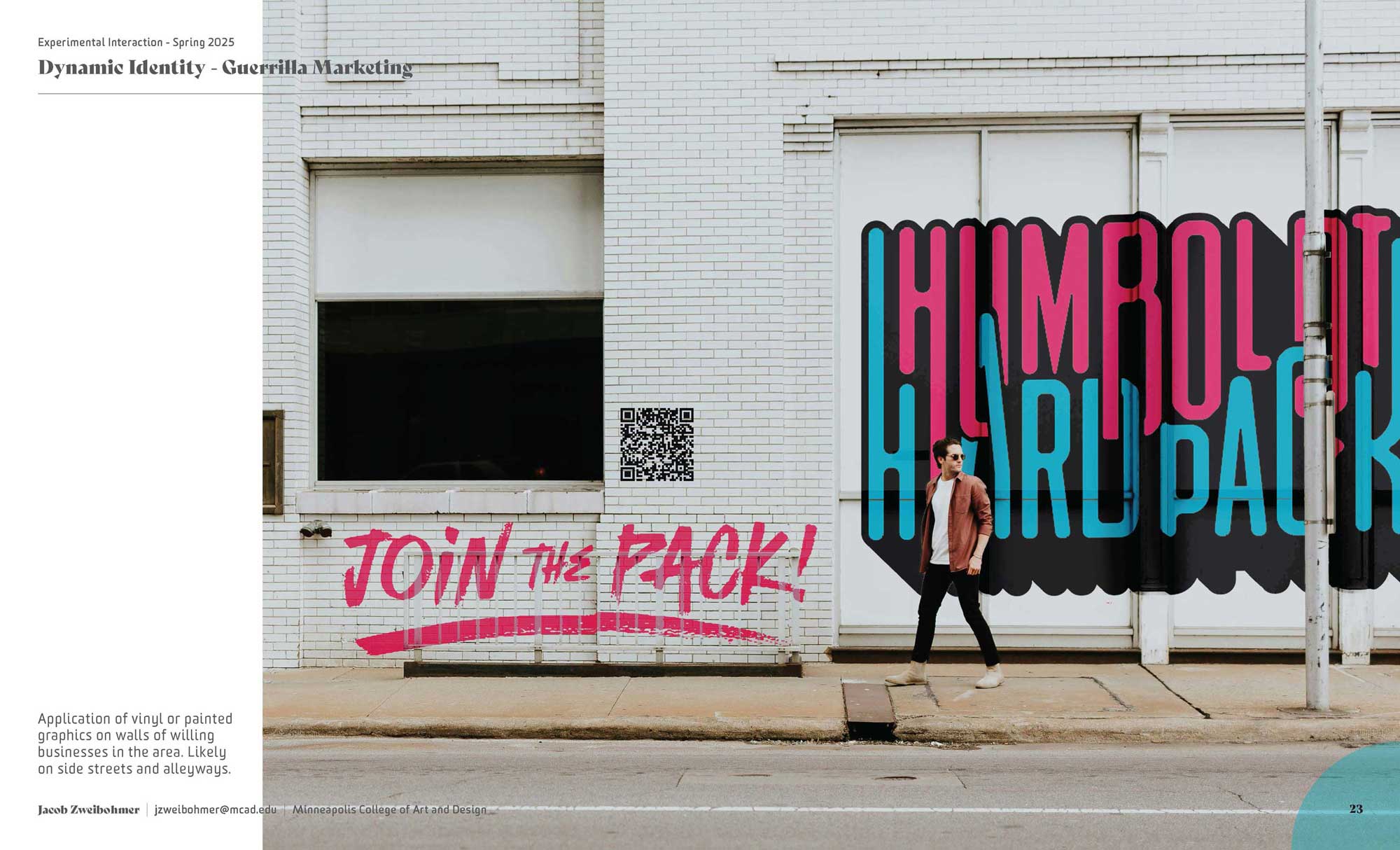
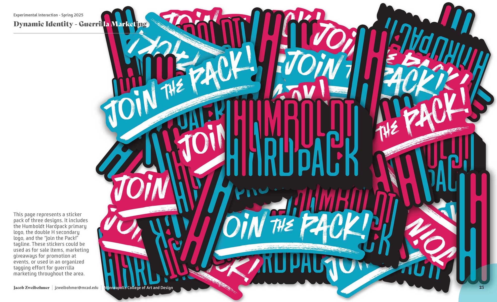
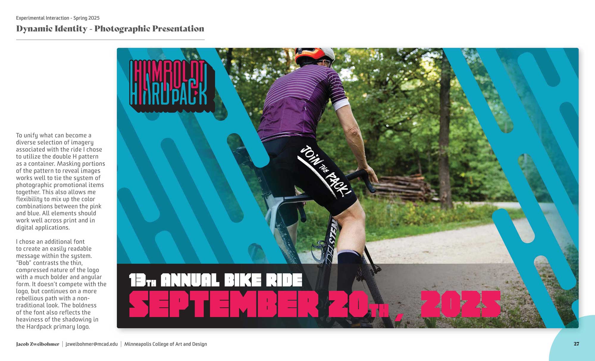
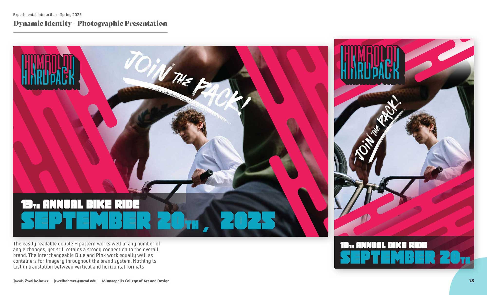
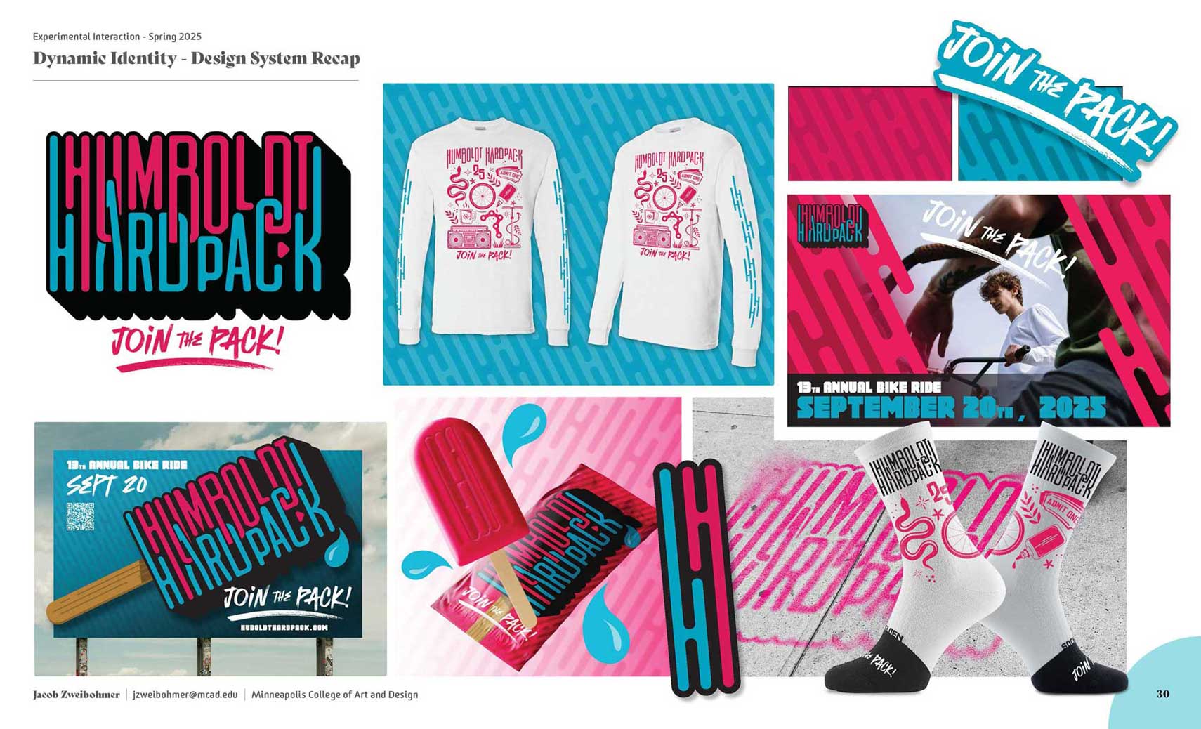
Humboldt Hardpack: I created a fundraiser bike ride in 2012 called the “Humboldt Hardpack”. This ride takes place annually on the Three Rivers Trail in Humboldt County Iowa. It is a crushed limestone trail, hence the name “Hardpack”. I’ve been able to do some fun things creatively over the years for the ride designs. However, the ride has never had an official logo or brand.
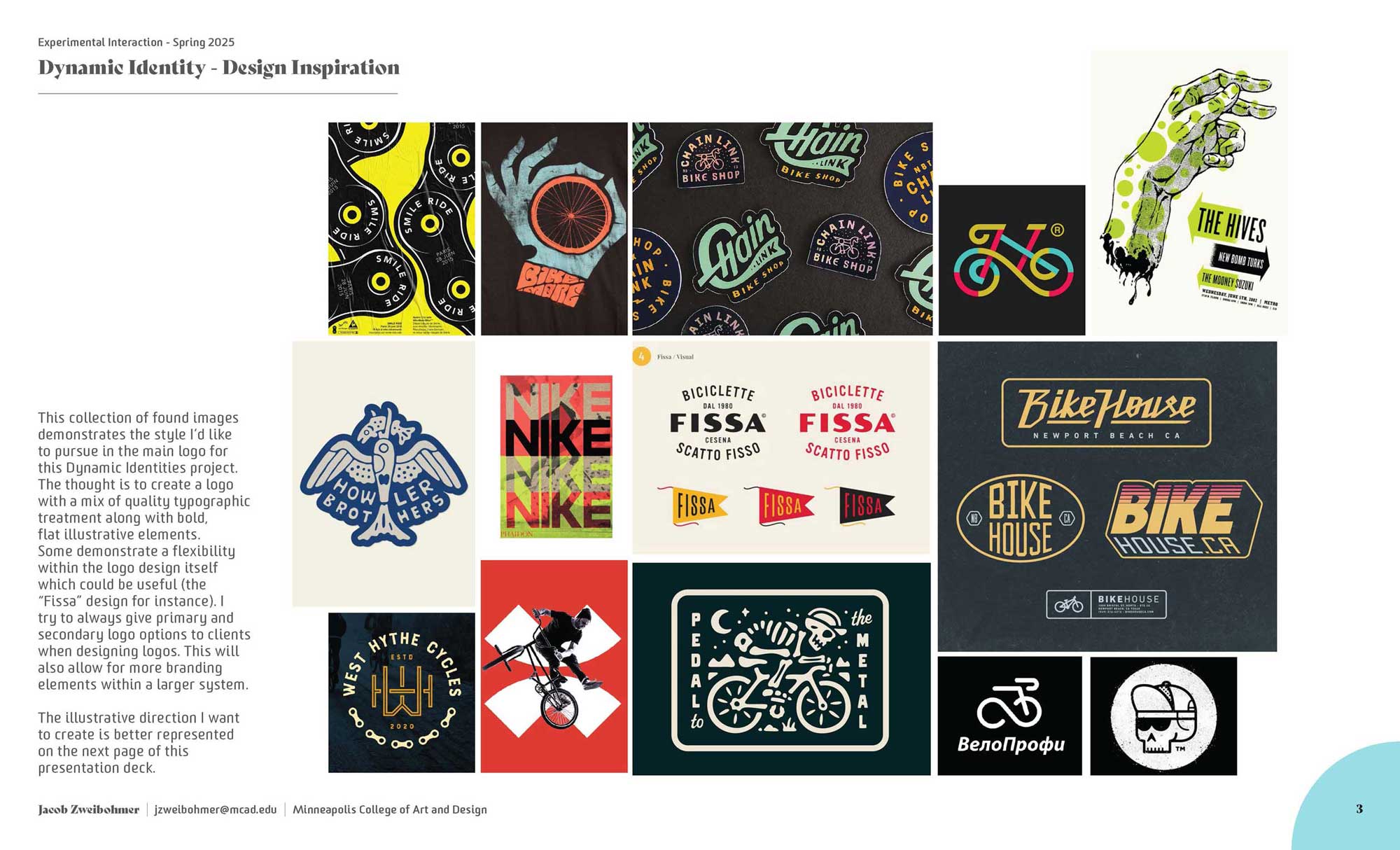
This Dynamic Identities project was meant to establish a sense of that for the ride. It now has an official wordmark logo, as well as a secondary double-H logo. The colors have been established as the blue and pink. A number of marketing tools have been generated, along with some apparel options.
This project will be put into use beginning this fall.
Click on the gallery, below, for larger images.
User Experience Design
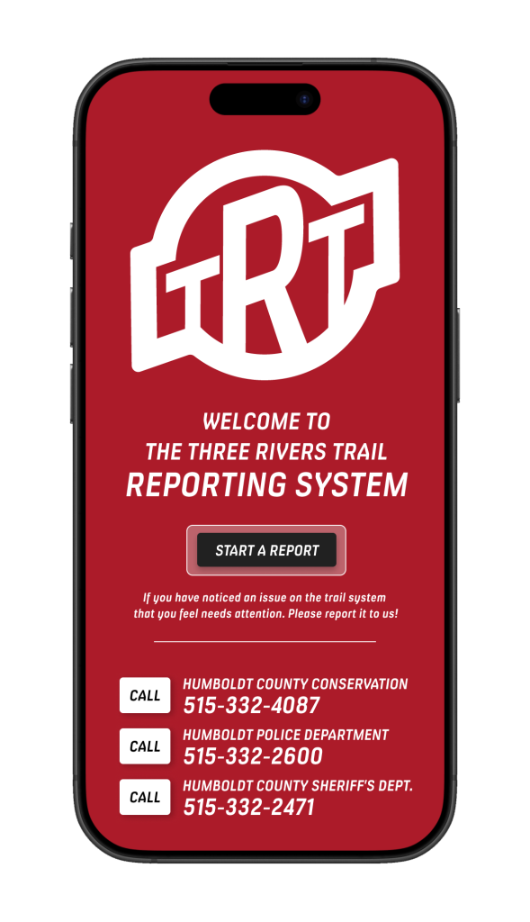
The Three Rivers Trail Reporting App:
Through the User Experience Design course I created and tested the Three Rivers Trail Reporting App. With an eye toward my Capstone project of a Wayfinding Signage system for this same trail, I felt I could create something with very practical use that could easily coincide with the sign system project. This app allows you to easily access emergency information as well as create an alert to any number of problems you might encounter on the trail. The information is then sent directly to members of Humboldt County Conservation who actively maintain the trail system. It was well received by frequent trail users whom I interviewed as well as by the county conservation crew.
You can access the Figma prototype by clicking on the image.
The user flow followed choosing “Unleashed Pets” in the Concern dropdown menu. Then you can choose to add an image.
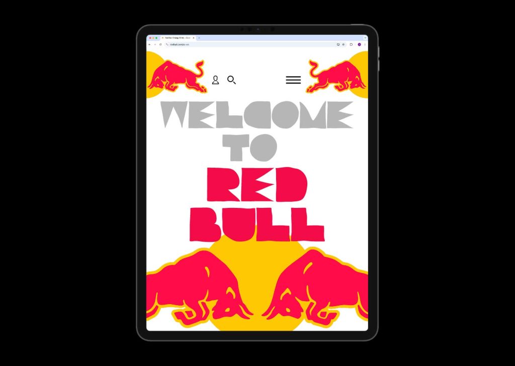
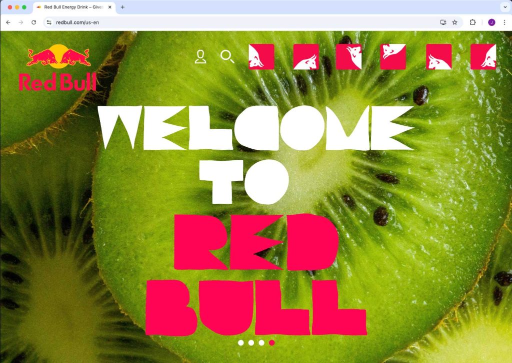
Web Design
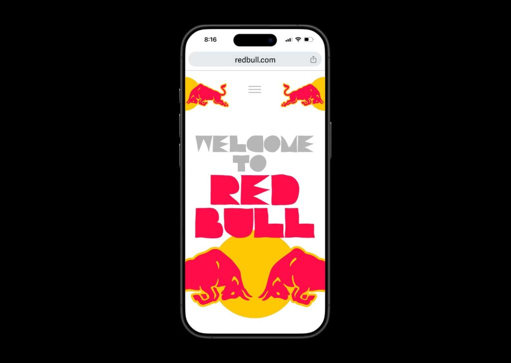
Red Bull Website Redesign:
In Web Design in the fall of 2024 we were tasked with choosing a well known brand with a web presence and reimagine it. I went with Red Bull. Red Bull’s current persona is very testosterone driven and is largely focused on extreme sports. While this works just fine for their brand I wanted to create something that still felt genuine to the brand, but also allowed the site to speak to a wider audience. I wanted there to be more of a social interaction with Red Bull customers. I wanted areas for people to share ideas, adventures, recipes, etc.
The main focus on my user journey was for a chef, who utilizes Red Bull in his creative culinary creations, to be able to sign up to be part of Red Bull events. My Figma prototype helps lead you through that process. Here you’ll find links to Figma prototypes for Mobile, Desktop, and Tablet variations of my website redo.
You can access the Figma prototypes by clicking on the images.